651 Carpets Platform
Summary
Challenge
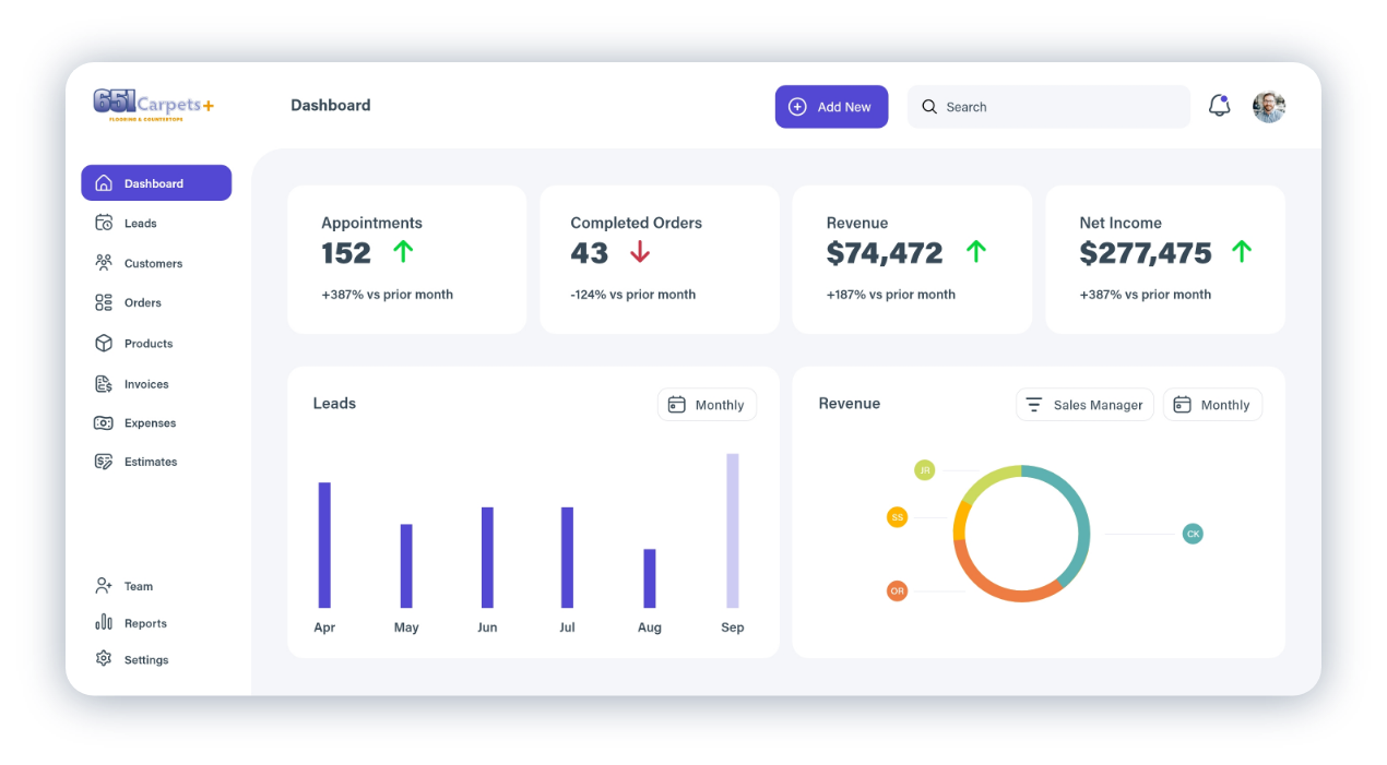
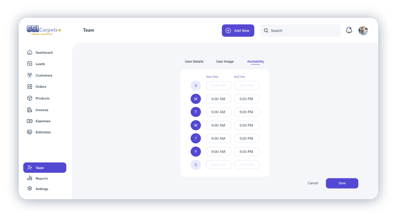
As I tackled the redesign project for 651 Carpets’ outdated software, RollMaster, I encountered numerous obstacles. The platform was cumbersome, bloated, and outdated, causing frustration among users and hindering productivity. Simple tasks were unnecessarily complex, impacting both efficiency and customer satisfaction. It was clear that modernizing the design and improving the user experience was imperative to keep the company competitive in the market and streamline operations.
Solution
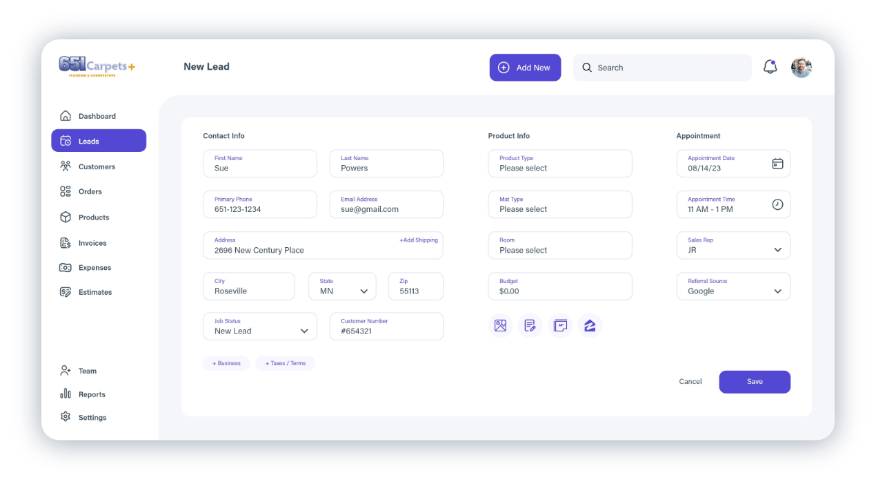
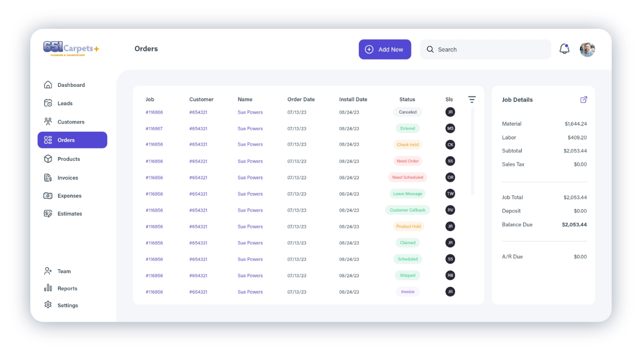
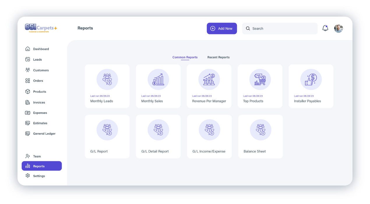
In response to the challenges posed by RollMaster, I embarked on a comprehensive redesign aimed at enhancing user experience and modernizing the interface. I conducted in-depth analysis to understand user needs and pain points, which informed the development of a streamlined and intuitive interface. Prioritizing simplicity, the new design featured clear navigation and user-friendly features to boost efficiency and productivity. By incorporating contemporary design principles and technologies, the revamped RollMaster software provided 651 Carpets with a modern solution that not only addressed their current challenges but also positioned them for future growth and success in the industry.
UX / UI
User Research
Based on current data, the United States employs over 21,840 flooring installers, with women comprising 5.1% and men 94.9% of the workforce. The average age of flooring installers is 40 years old. In terms of ethnicity, the majority of flooring installers are White (60.8%), followed by Hispanic or Latino (25.9%), Black or African American (7.7%), and Unknown (3.9%).
Persona
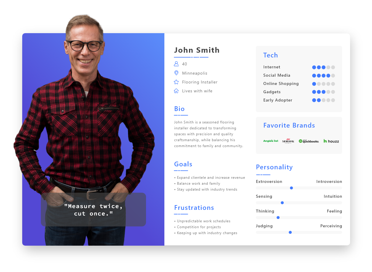
Based on the findings of the user research and data, I created a persona to help inform my decisions as I started to design.
Branding
Logo
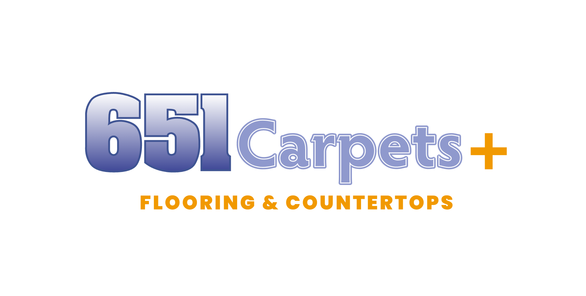
In updating the 651 Carpets brand, I aimed to reflect our expansion beyond carpets while maintaining our established identity. I introduced an orange “+” symbol to signify our diversification into various types of flooring. Additionally, I incorporated a bright orange subtitle, “Flooring & Countertops,” to clearly communicate our offerings. The choice of vibrant orange was deliberate, as it exudes modernity and catches the eye effectively.
Design System
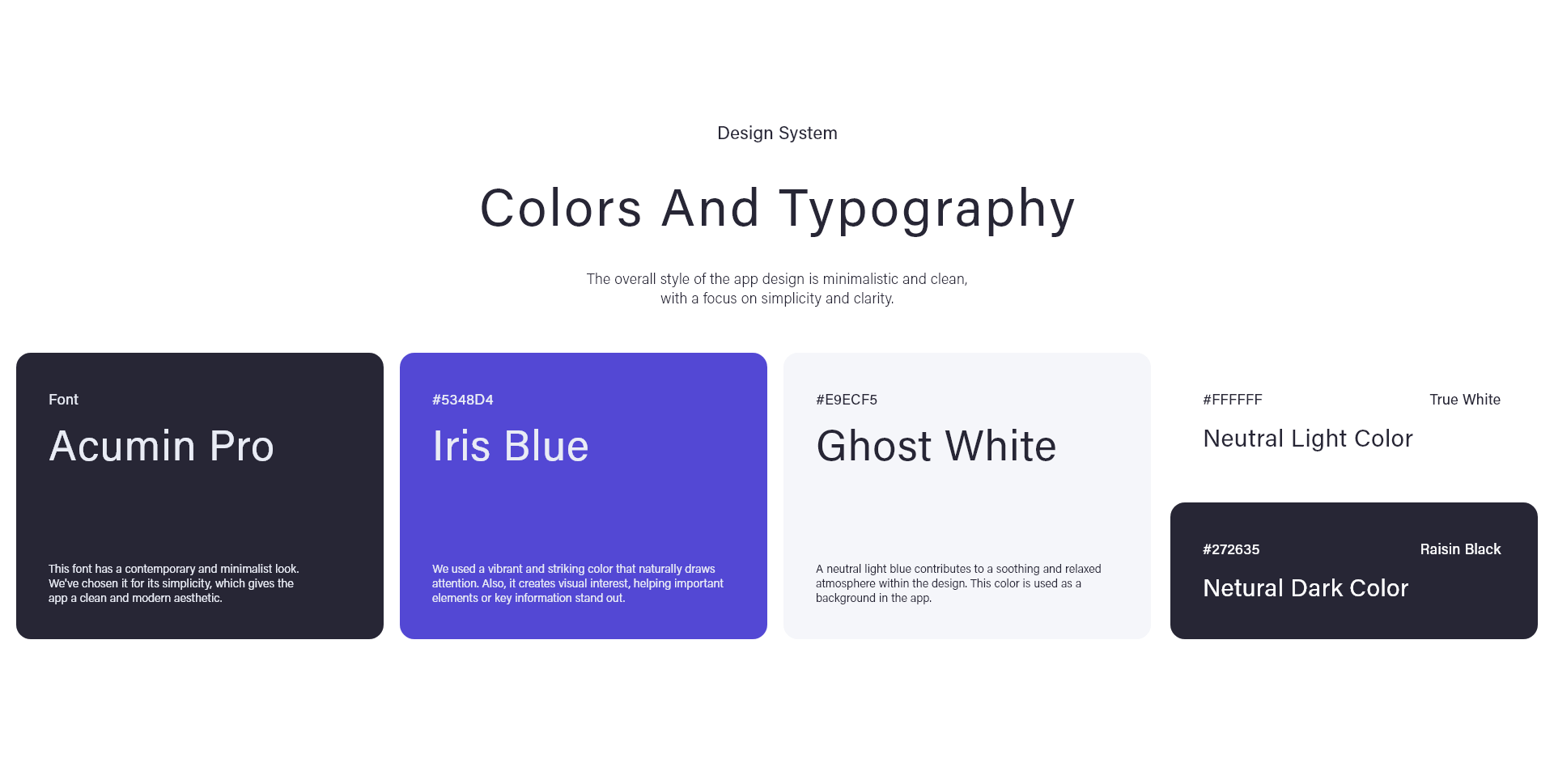
Color Palette: To honor our brand’s legacy, I retained the original bluish-purple color while infusing it with a brighter, more contemporary shade for our platform interface (called Iris Blue). This purple-blue hue not only pays homage to our roots but also ensures coherence with our refreshed visual identity. Overall, my design approach emphasizes both innovation and continuity, showcasing our commitment to evolving while staying true to our heritage.
Typography: Acumin Pro is used consistently across the platform for its contemporary and minimalist appearance. It’s chosen for its clarity and simplicity, aligning perfectly with the brand’s aesthetic.


