
651 Carpets Platform
Product Design
Branding
UX / UI
Prototype
Information Architecture
Summary
Challenge
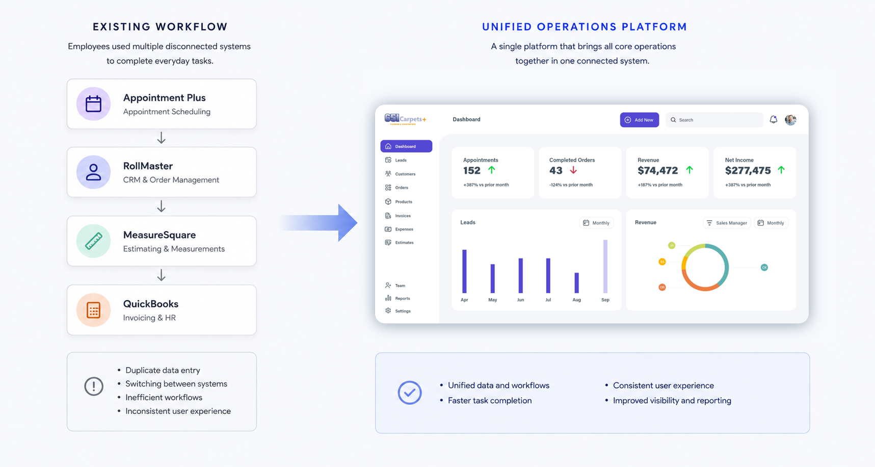
651 Carpets relied on four disconnected business systems to manage every stage of its operations—from scheduling and customer management to estimating, product management, and invoicing. Employees regularly moved between applications to complete routine tasks, creating inefficient workflows and an inconsistent user experience.
Rather than simply redesigning an outdated interface, the objective was to consolidate these operational workflows into a single platform that preserved the functionality of each system while making everyday tasks significantly easier to navigate.
Solution
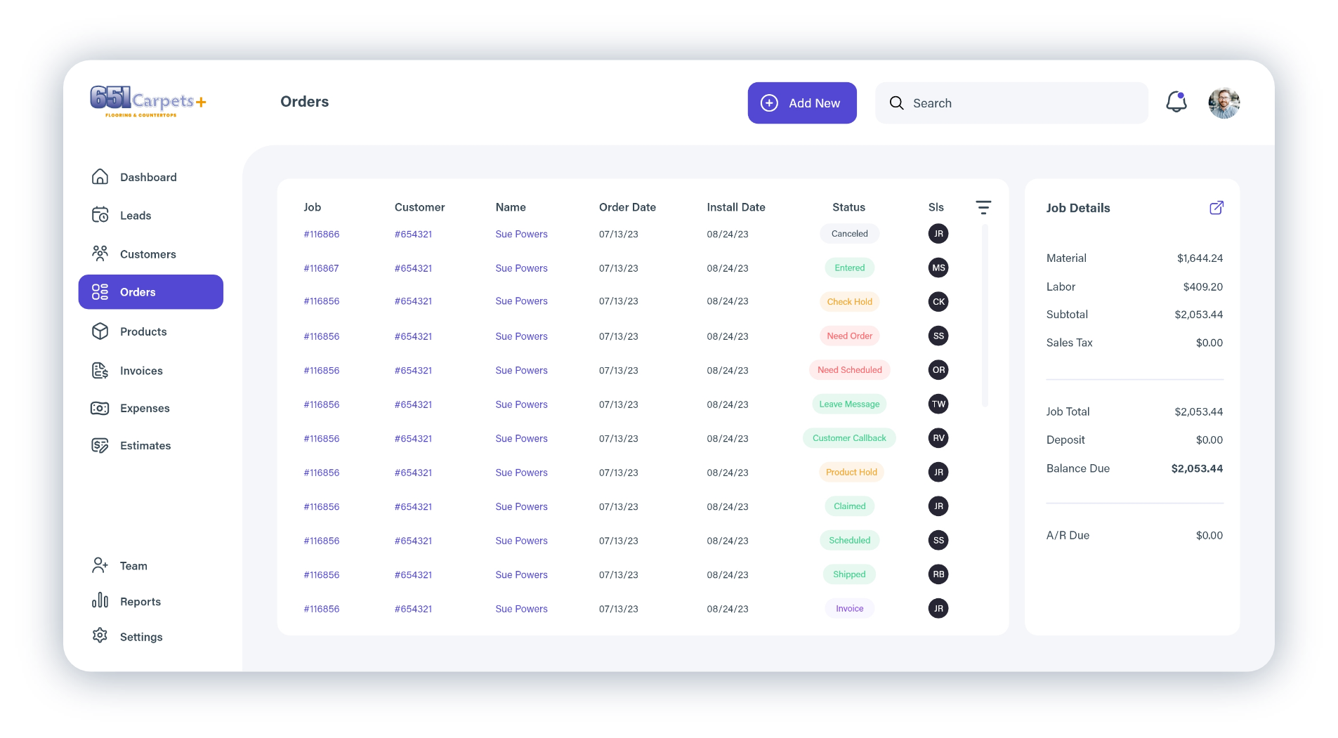
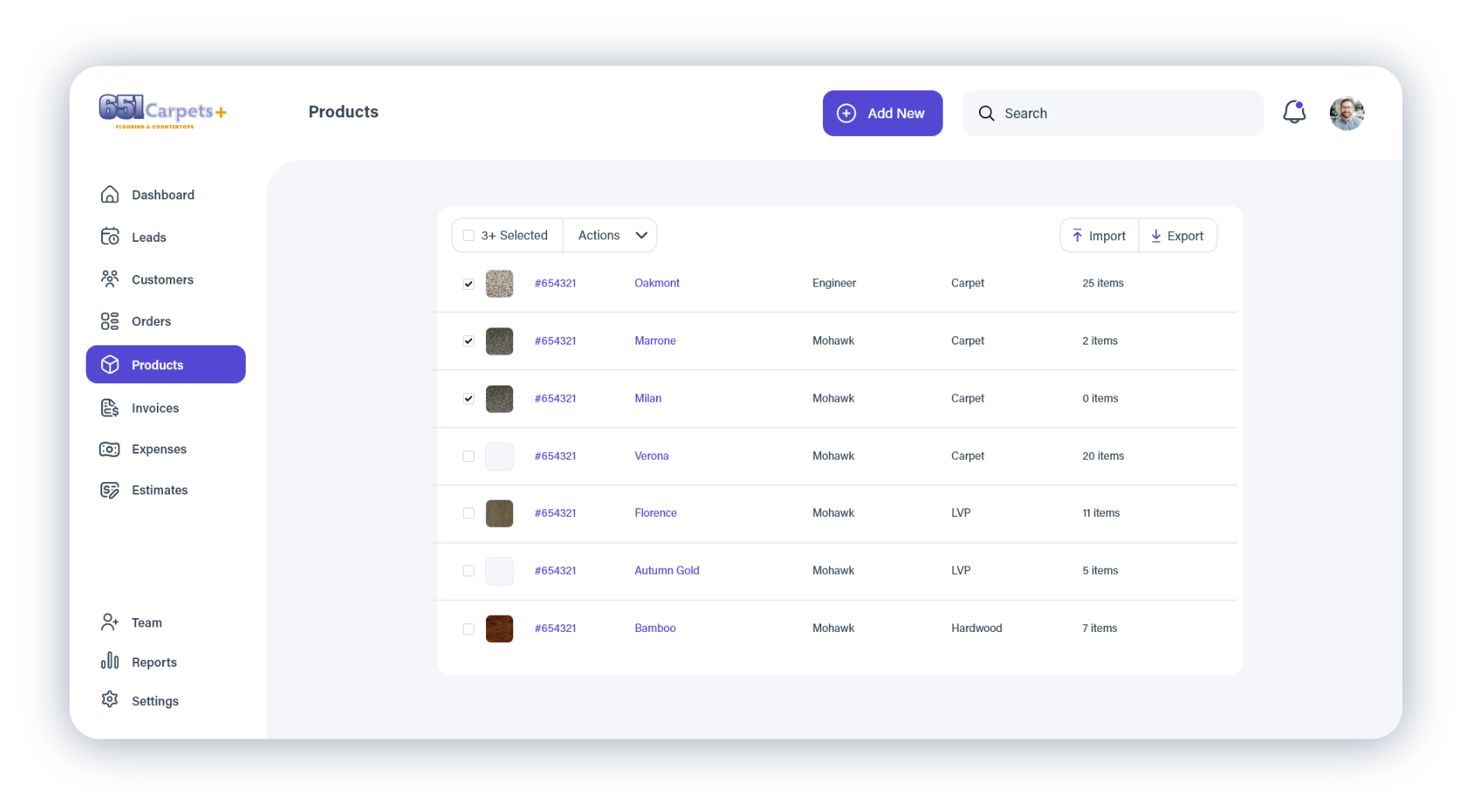
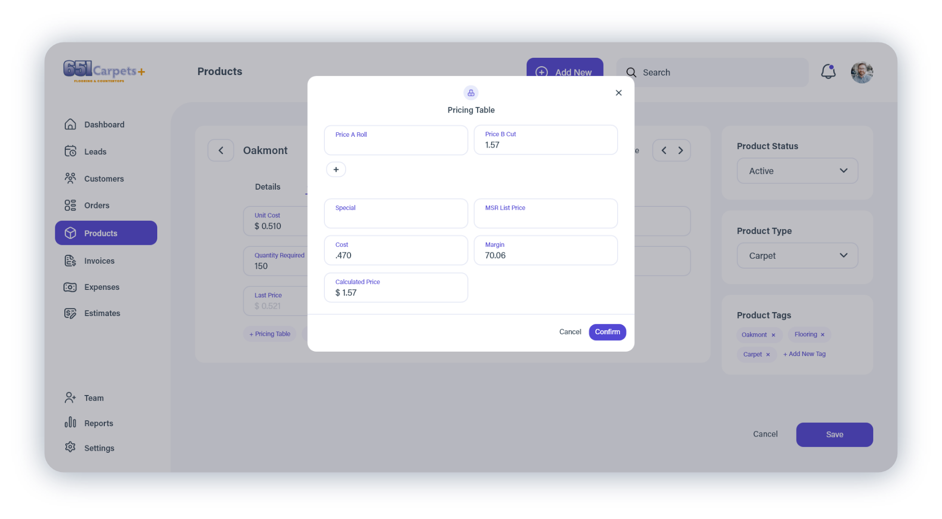
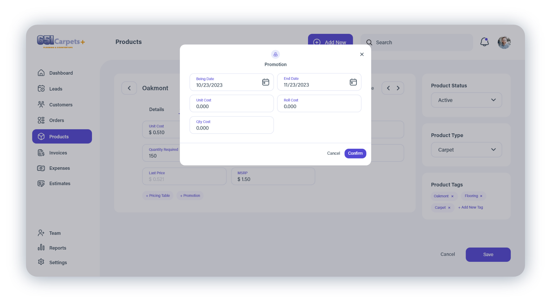
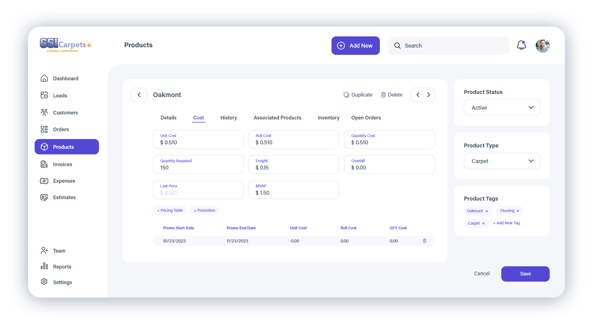
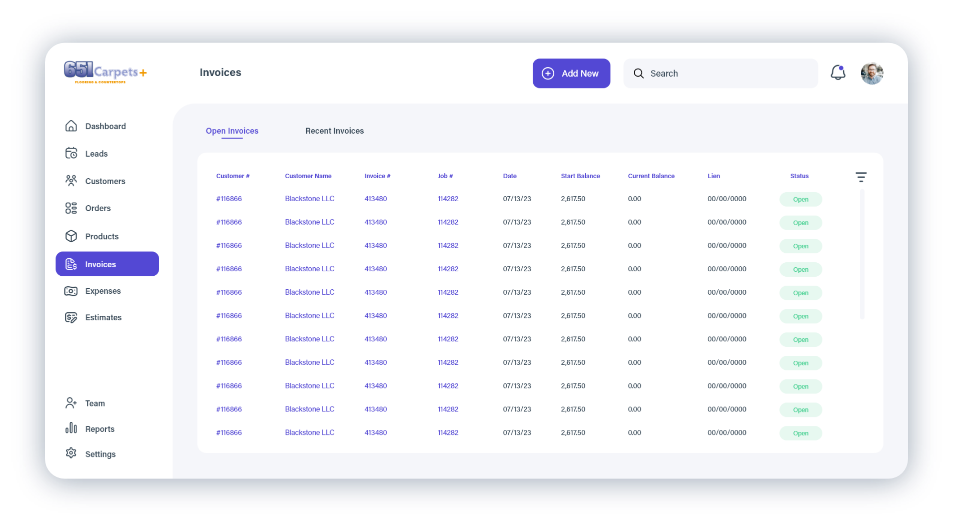
To better understand the problem space, I analyzed each platform and mapped how information flowed between scheduling, customer management, estimating, product management, and invoicing. Rather than reinventing familiar interactions, I referenced established products such as Shopify where appropriate, adopting proven patterns that would reduce the learning curve and create a more intuitive experience.
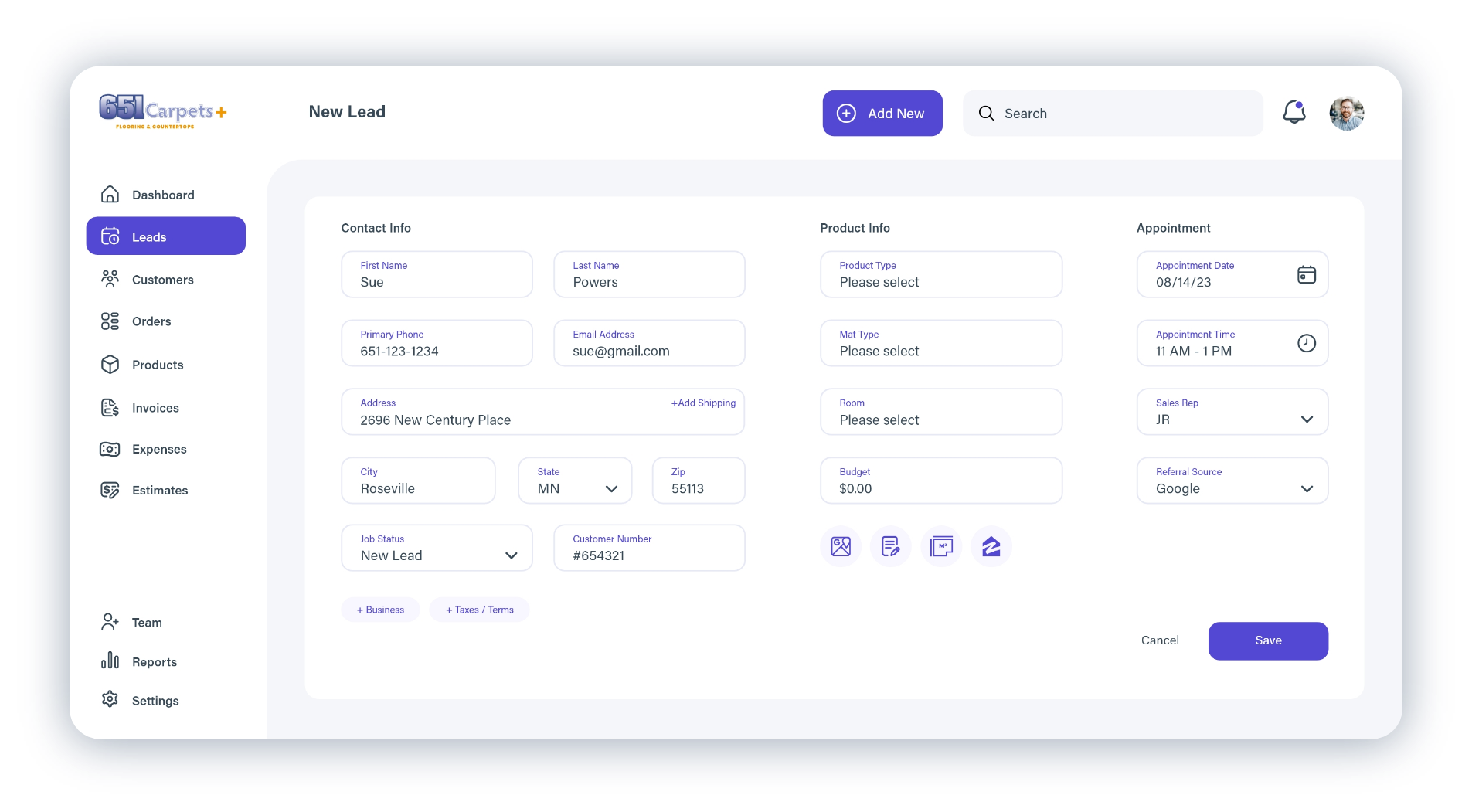
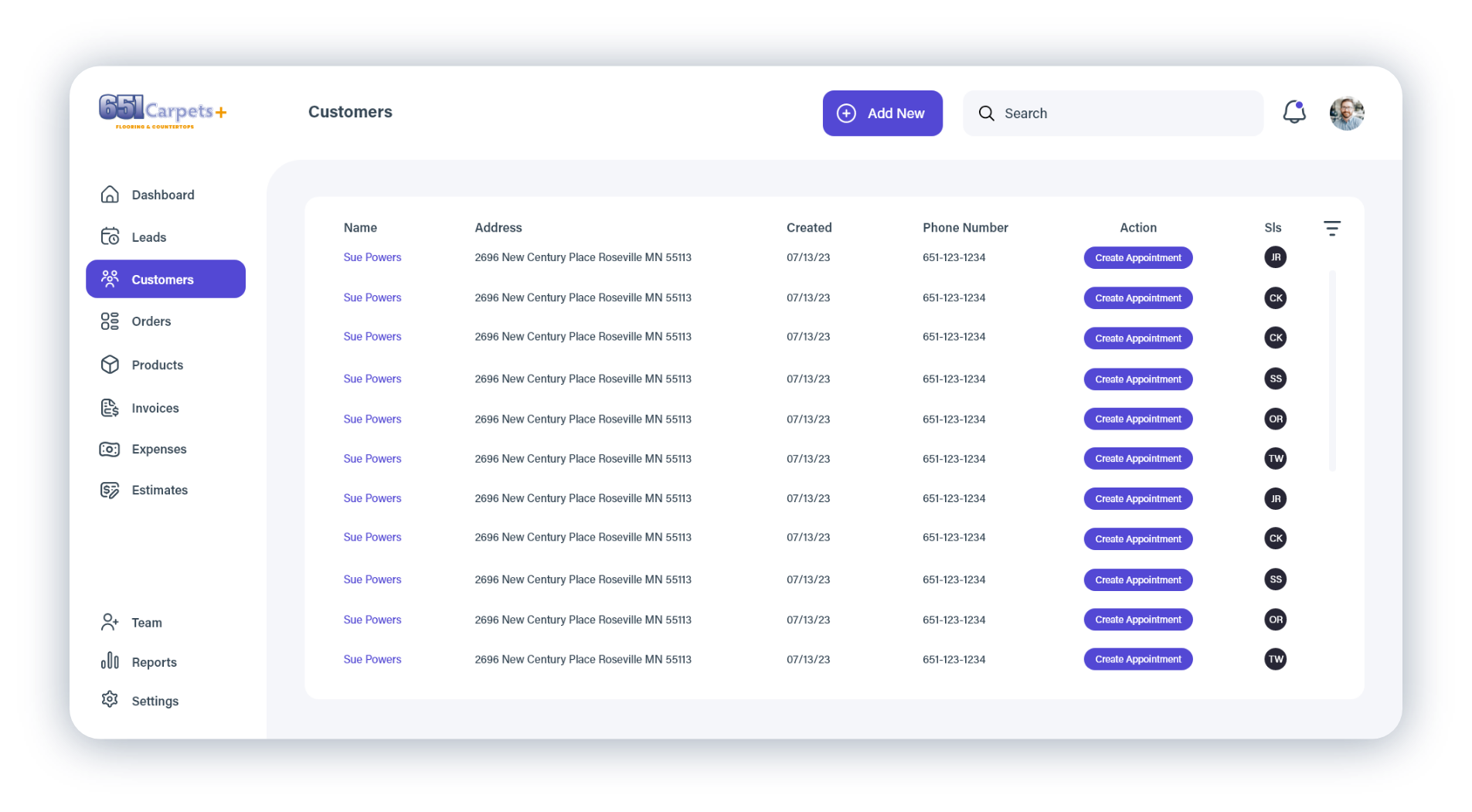
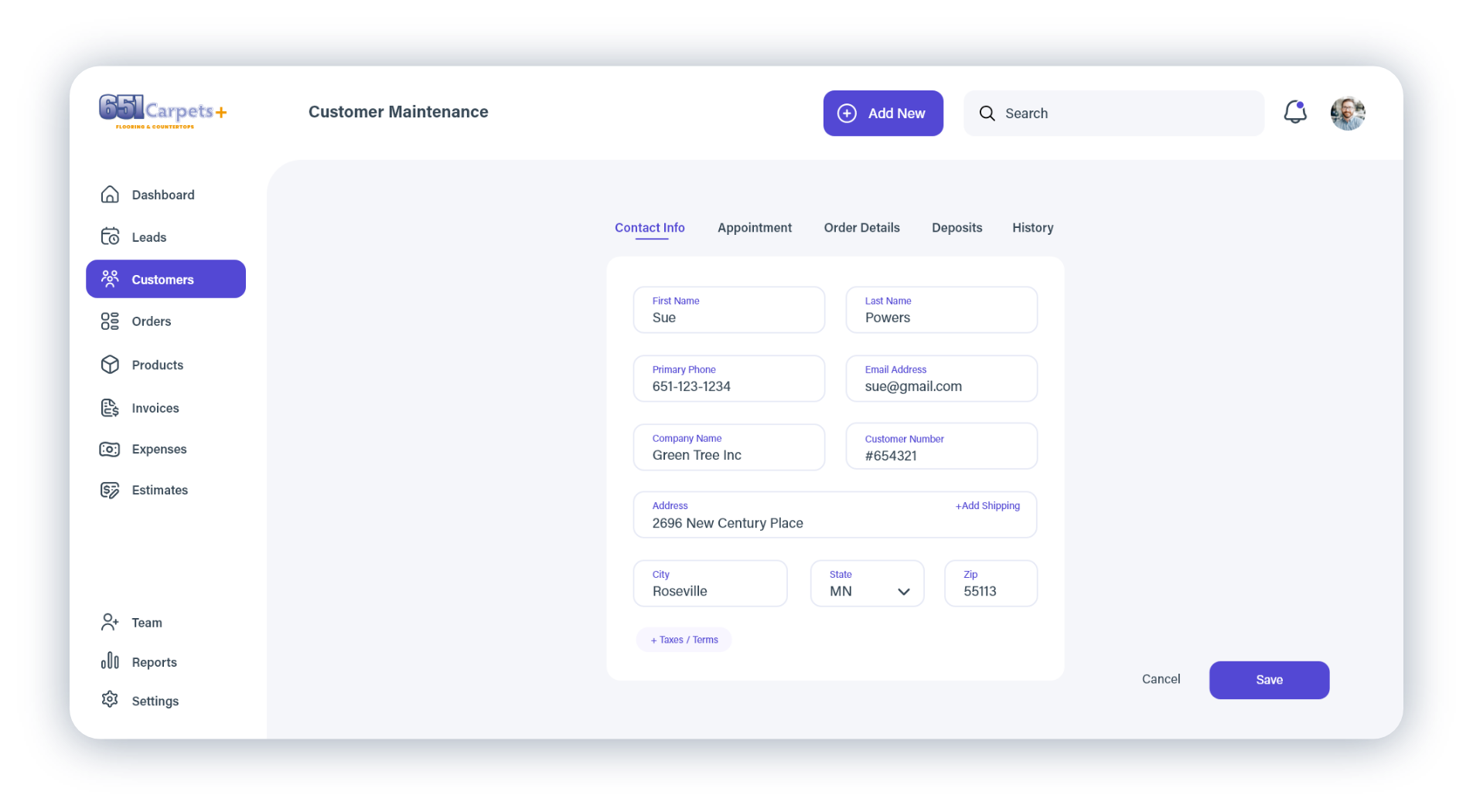
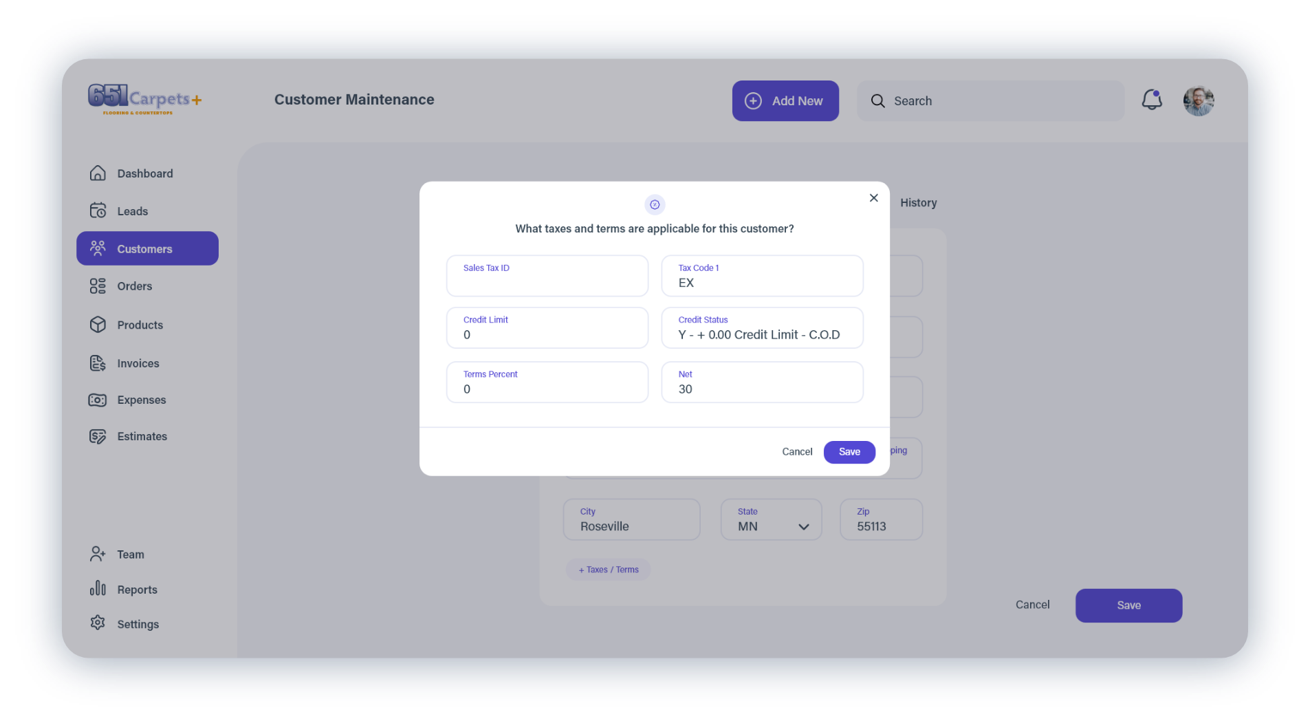
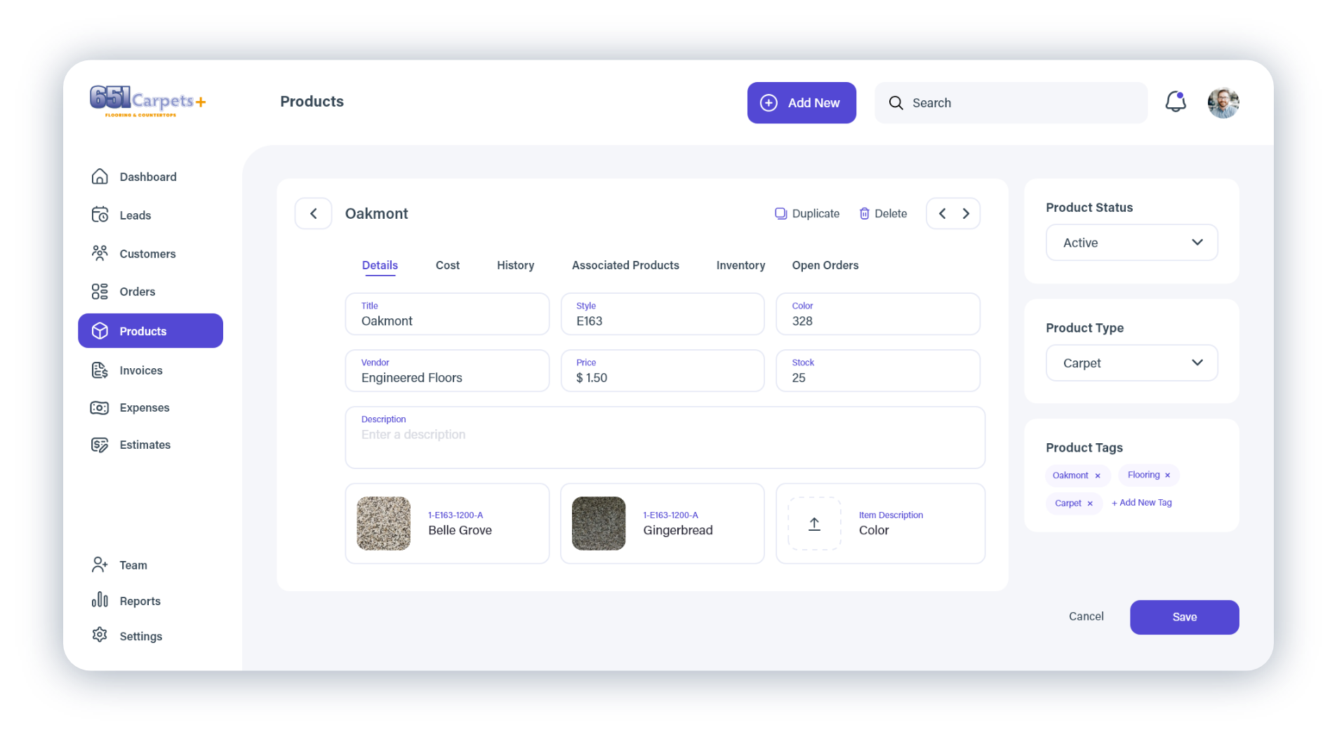
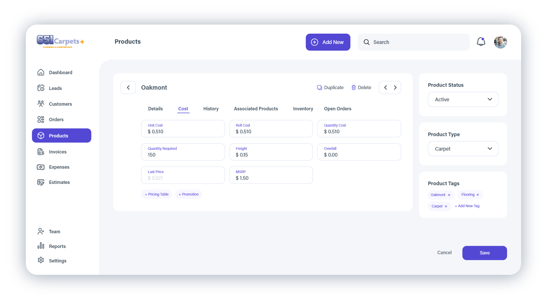
Using Adobe XD, I designed a unified platform that simplified navigation, organized related workflows together, and modernized the overall user experience while remaining practical for implementation.
Although the project ultimately paused before launch due to shifting business priorities, it became one of the most valuable product design challenges of my career, reinforcing the importance of simplifying complex operational workflows while designing around real business constraints.
UX / UI
Design Challenges
Designing the platform required balancing several independent systems that had evolved separately over time while maintaining the functionality employees relied on every day.
Key areas included:
- Customer Relationship Management (CRM)
- Appointment Scheduling
- Estimating
- Product Management
- Inventory
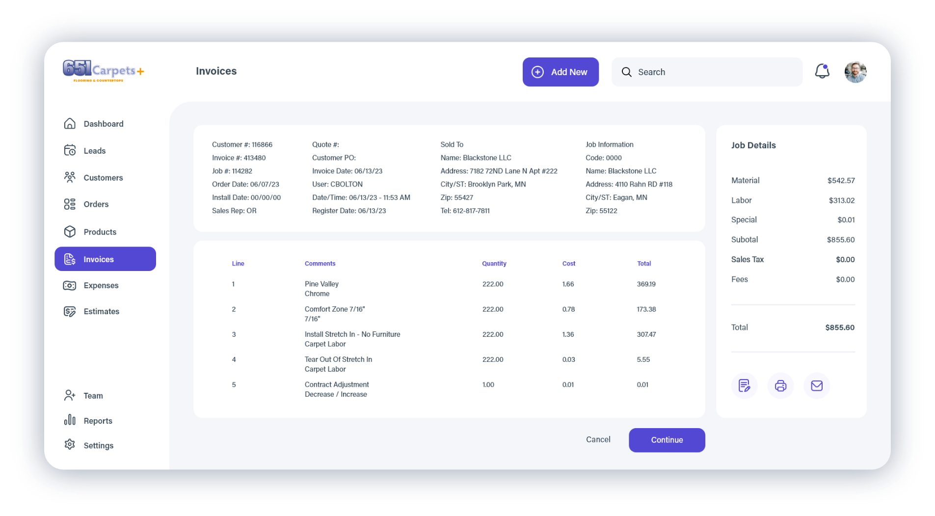
- Invoicing
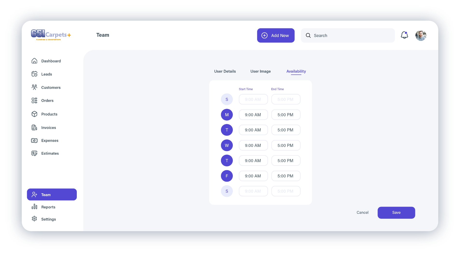
- Human Resources
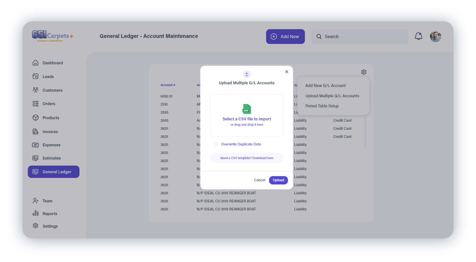
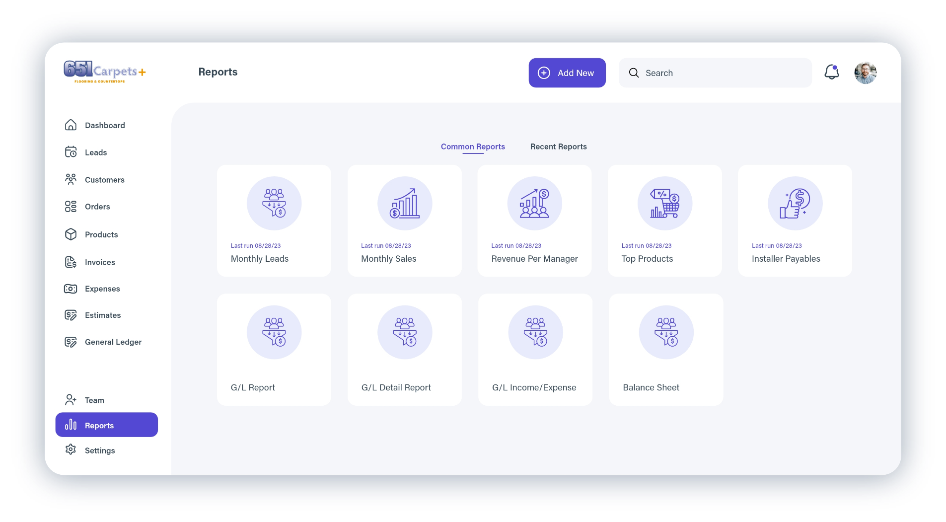
- Reporting & Administration
The primary design goal was not to remove functionality, but to reduce complexity through improved information architecture, clearer navigation, and more consistent interaction patterns.
Design Approach
Rather than designing each feature independently, I approached the platform as a connected system.
Throughout the project I focused on:
- Simplifying complex workflows into logical user journeys
- Reducing navigation depth and cognitive load
- Creating consistent interaction patterns across the platform
- Leveraging familiar conventions from established products where appropriate
- Designing interfaces that balanced business requirements with everyday usability
This systems-first approach helped transform multiple disconnected applications into a more cohesive product experience.
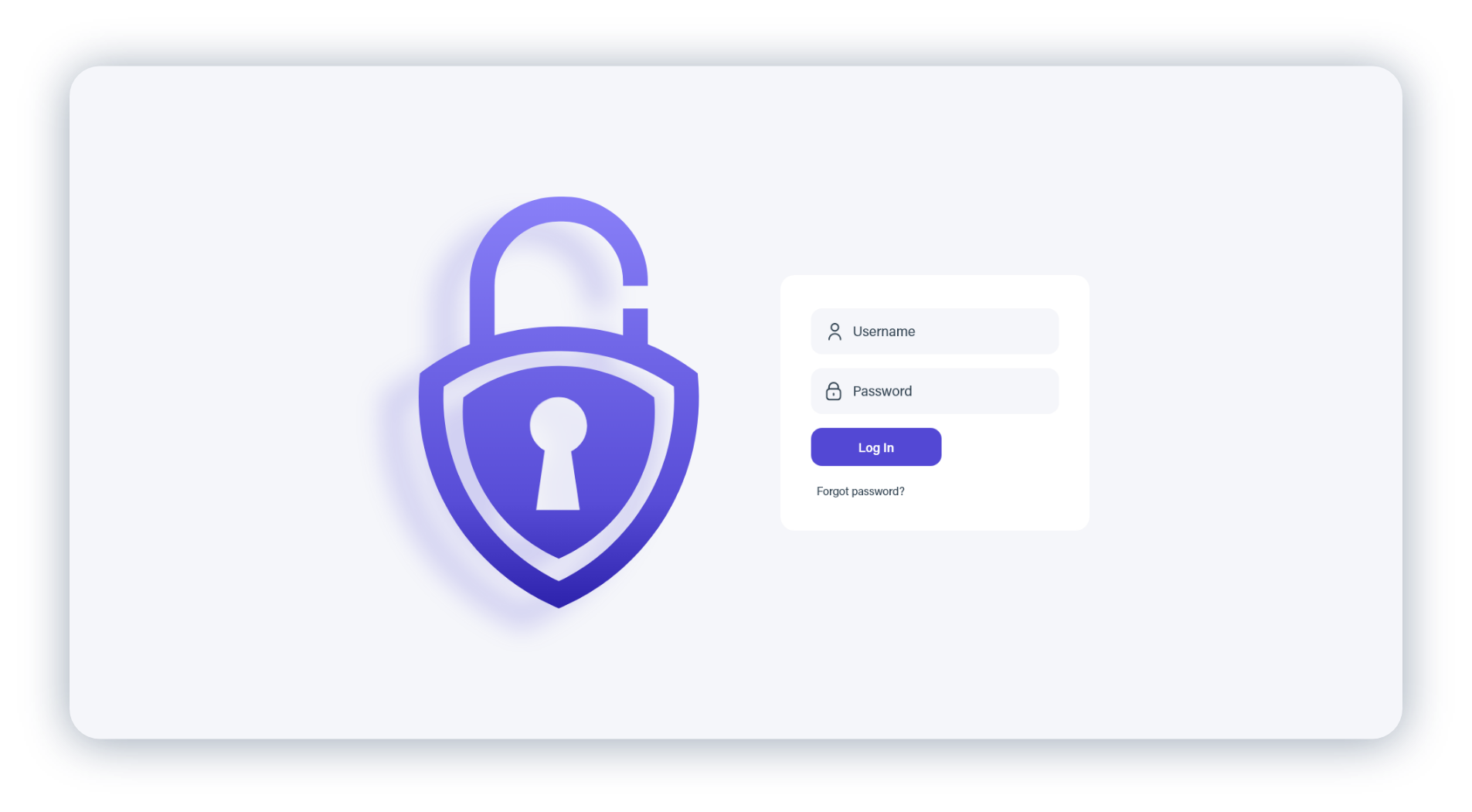
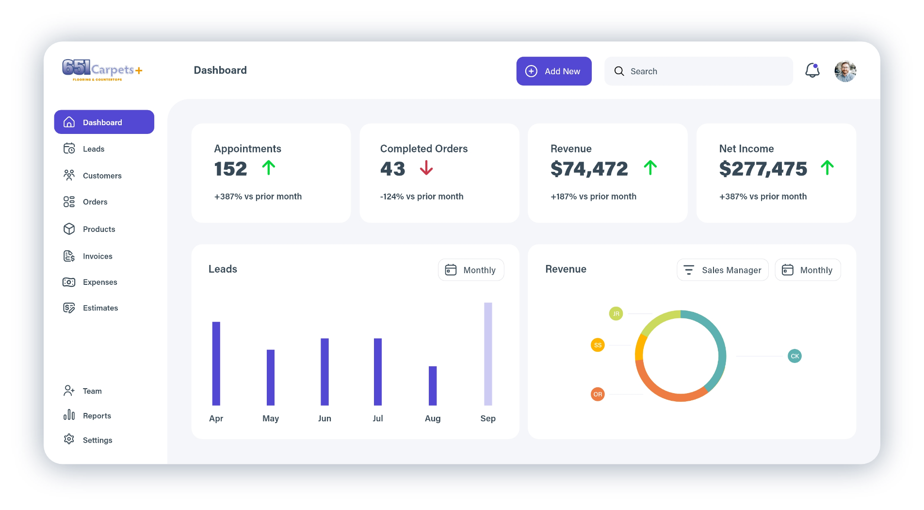
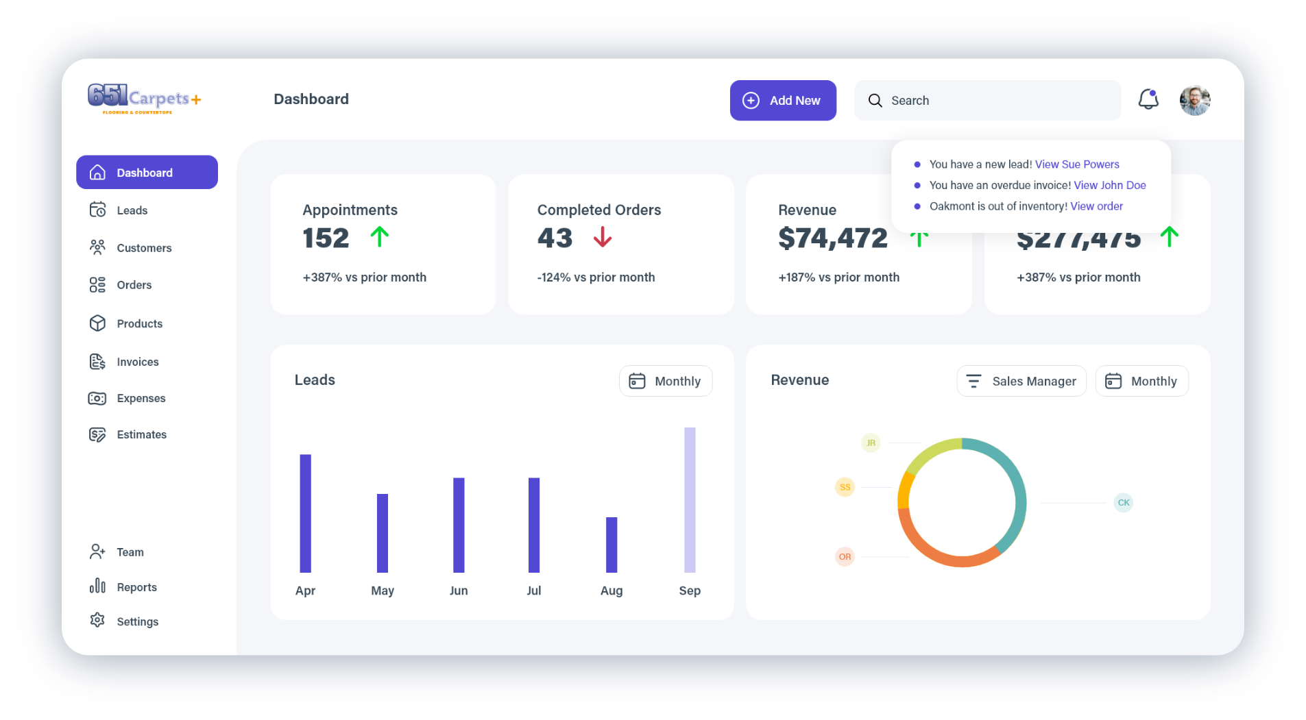
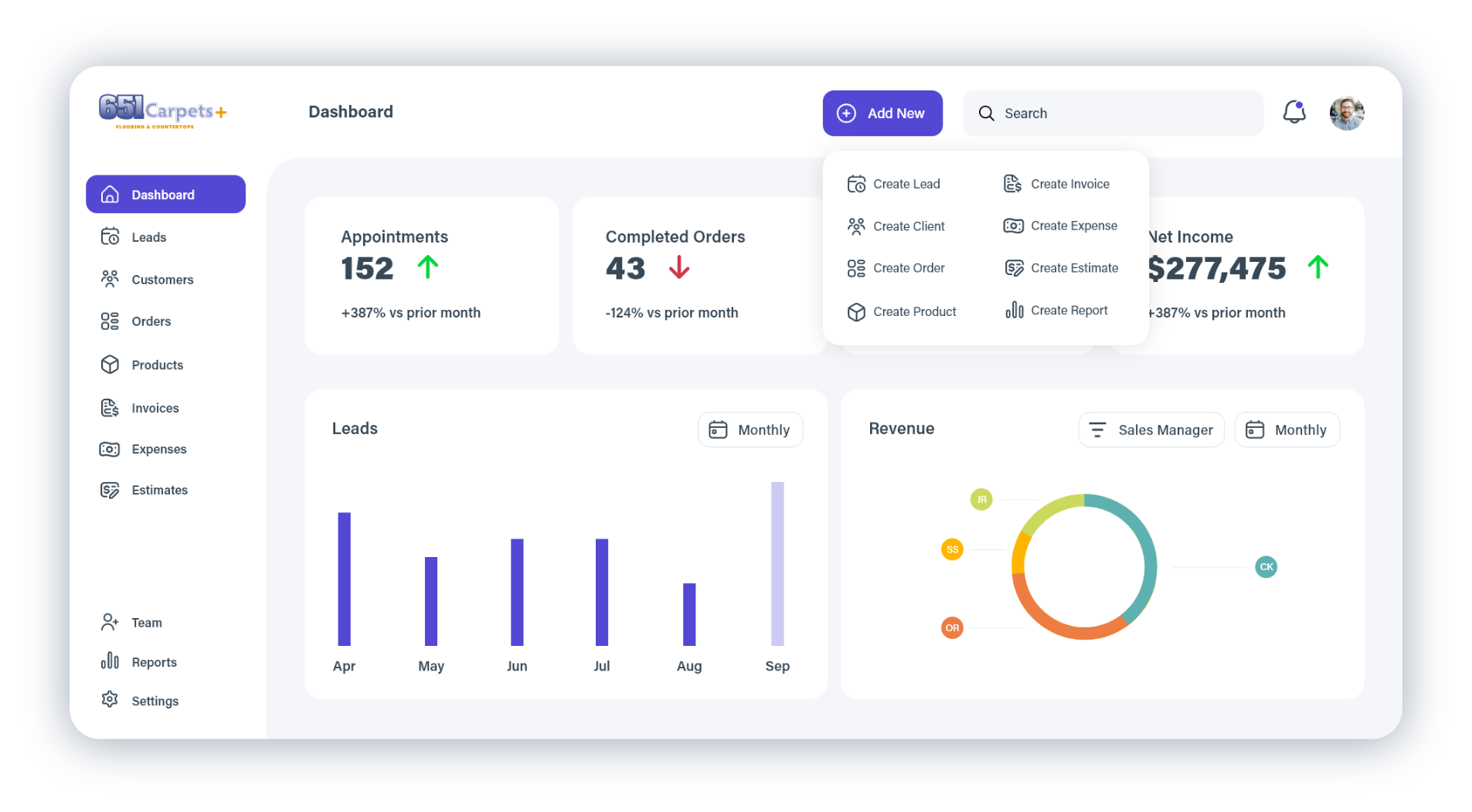
Primary User
User Research
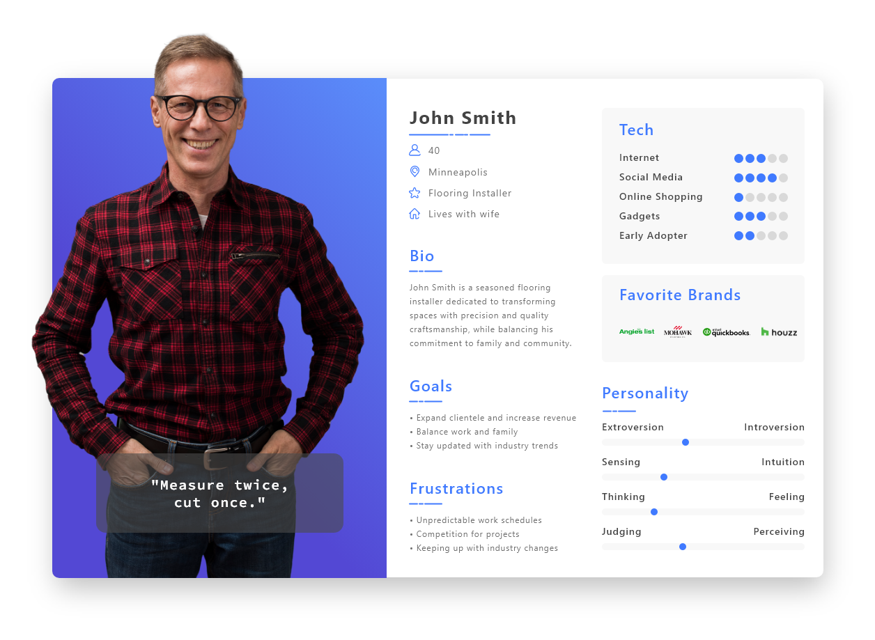
The platform was designed primarily for flooring sales and operations staff responsible for managing customers, appointments, estimates, product catalogs, orders, and invoicing throughout the sales process.
Their success depended on quickly navigating between related tasks while minimizing unnecessary clicks and duplicate data entry.
Branding
Logo
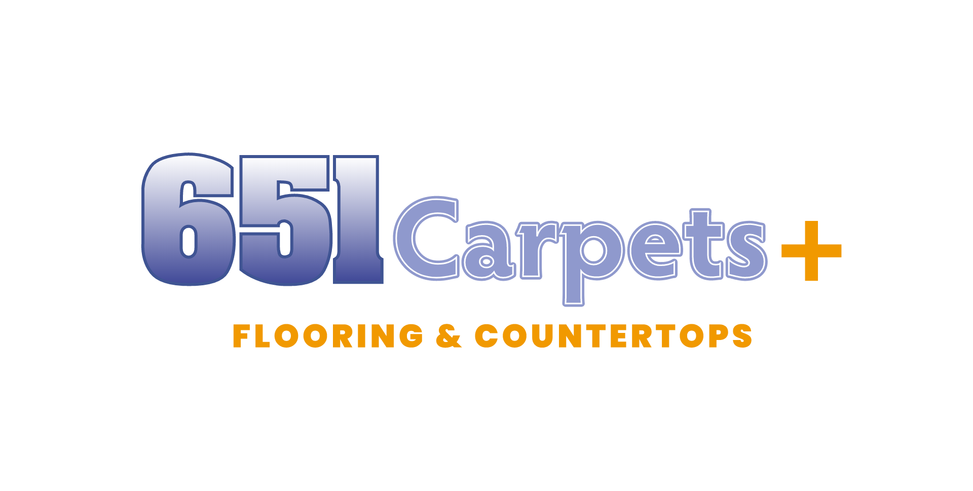
The platform redesign extended beyond workflows to establish a more modern visual identity that reflected the company’s growth beyond carpet installation.
The existing brand was recognizable but dated, so I introduced a refreshed identity that maintained familiarity while creating a cleaner, more contemporary foundation for both the application and the broader brand. An orange “+” symbol was introduced to represent the company’s expansion into additional flooring and countertop products, while updated typography and color choices helped create a more approachable, professional experience.
Design System
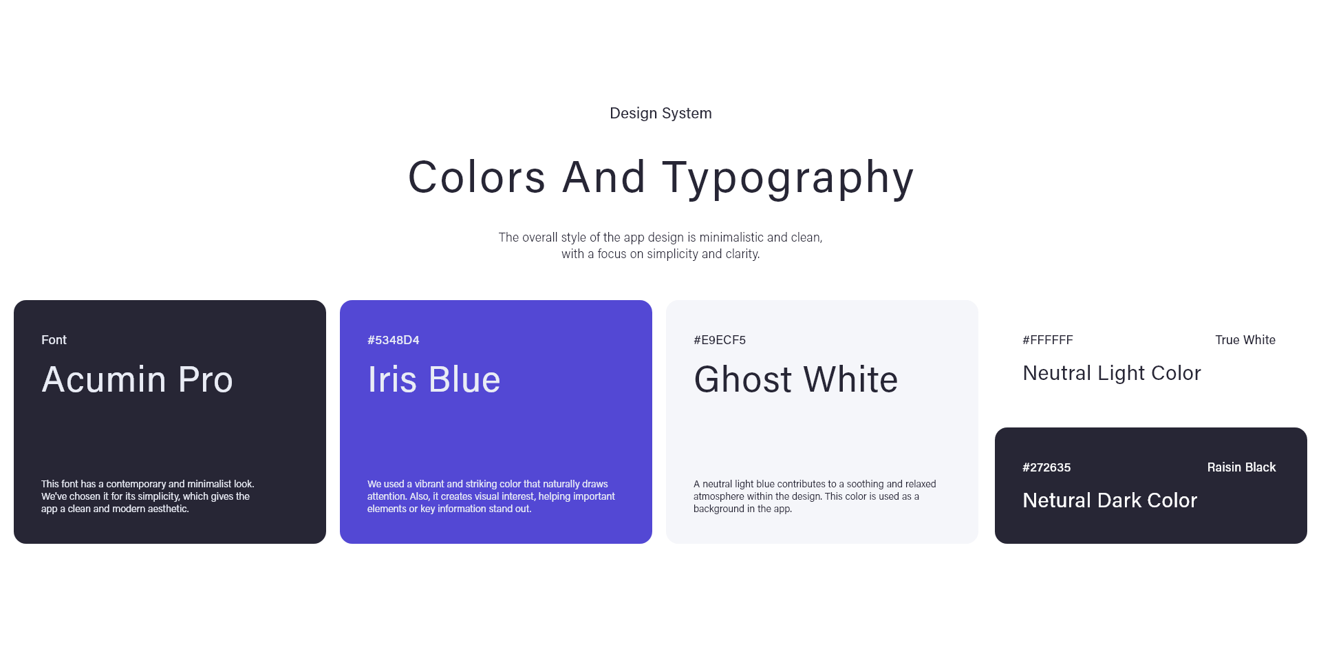
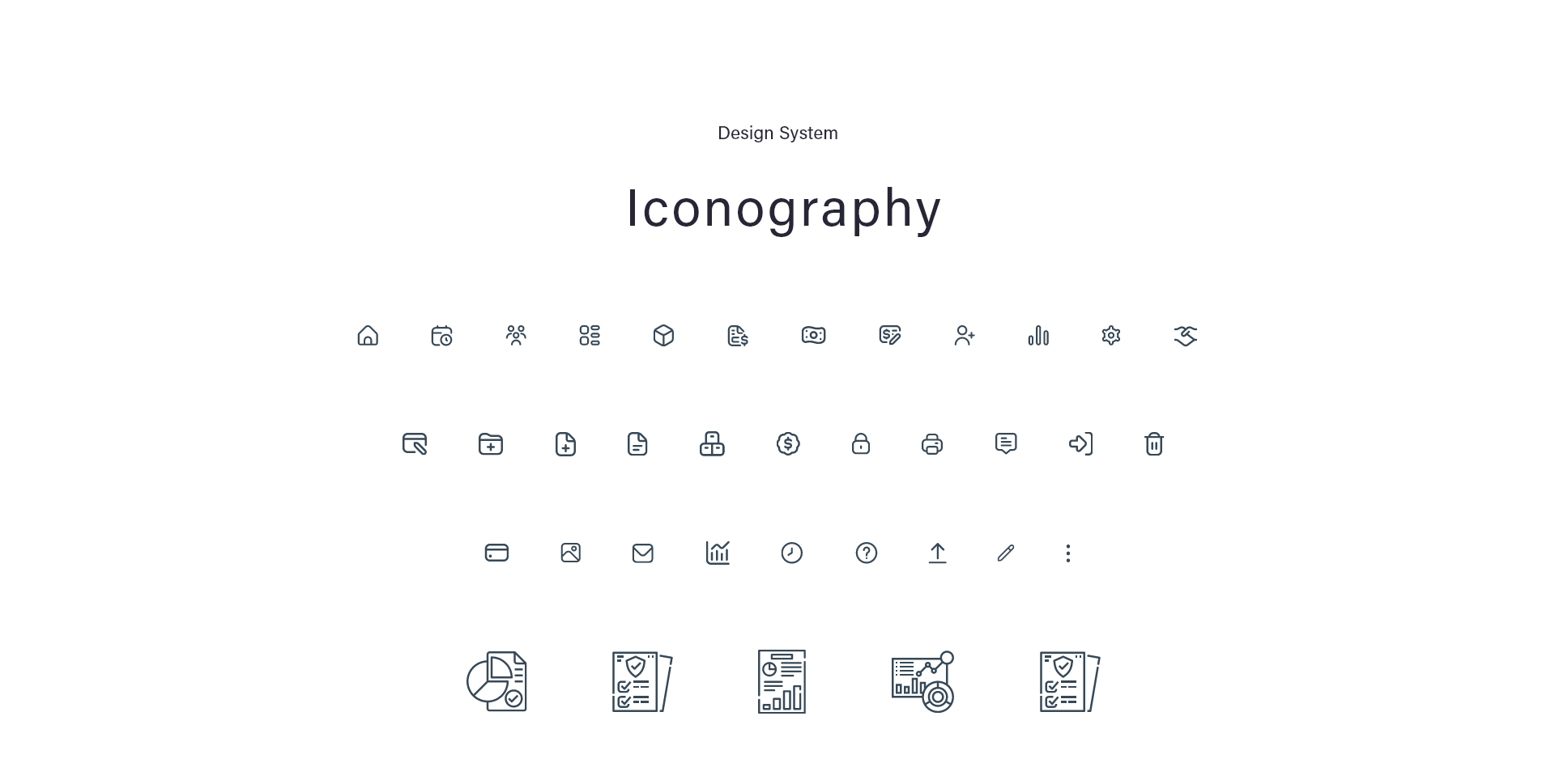
A lightweight design system was developed to improve consistency across the application, including color, typography, spacing, buttons, forms, navigation, and common UI components. Establishing these standards made the interface easier to learn, reduced visual noise, and created a foundation that could scale as additional functionality was added.
To maintain familiarity, I retained elements of the existing brand while modernizing the interface. The refreshed “Iris Blue” palette provided continuity with the company’s identity, while Acumin Pro was selected for its clarity and readability across data-heavy screens.