Accura HealthCare
Summary
Challenge
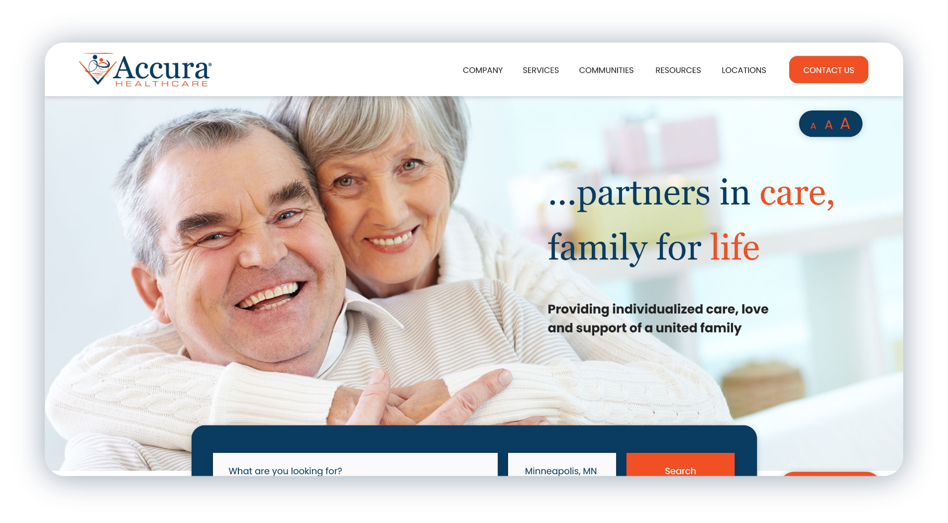
When I first encountered Accura Healthcare’s website, it was evident that it lacked the modern design and user-friendly features necessary to effectively serve its audience. The outdated appearance and lack of intuitive navigation hindered users from easily accessing essential information about the nursing homes and assisted living facilities offered to senior citizens. Additionally, there was no efficient way for users to locate facilities near them, resulting in a disjointed user experience and potentially missed opportunities for Accura Healthcare to connect with its target demographic.
Solution
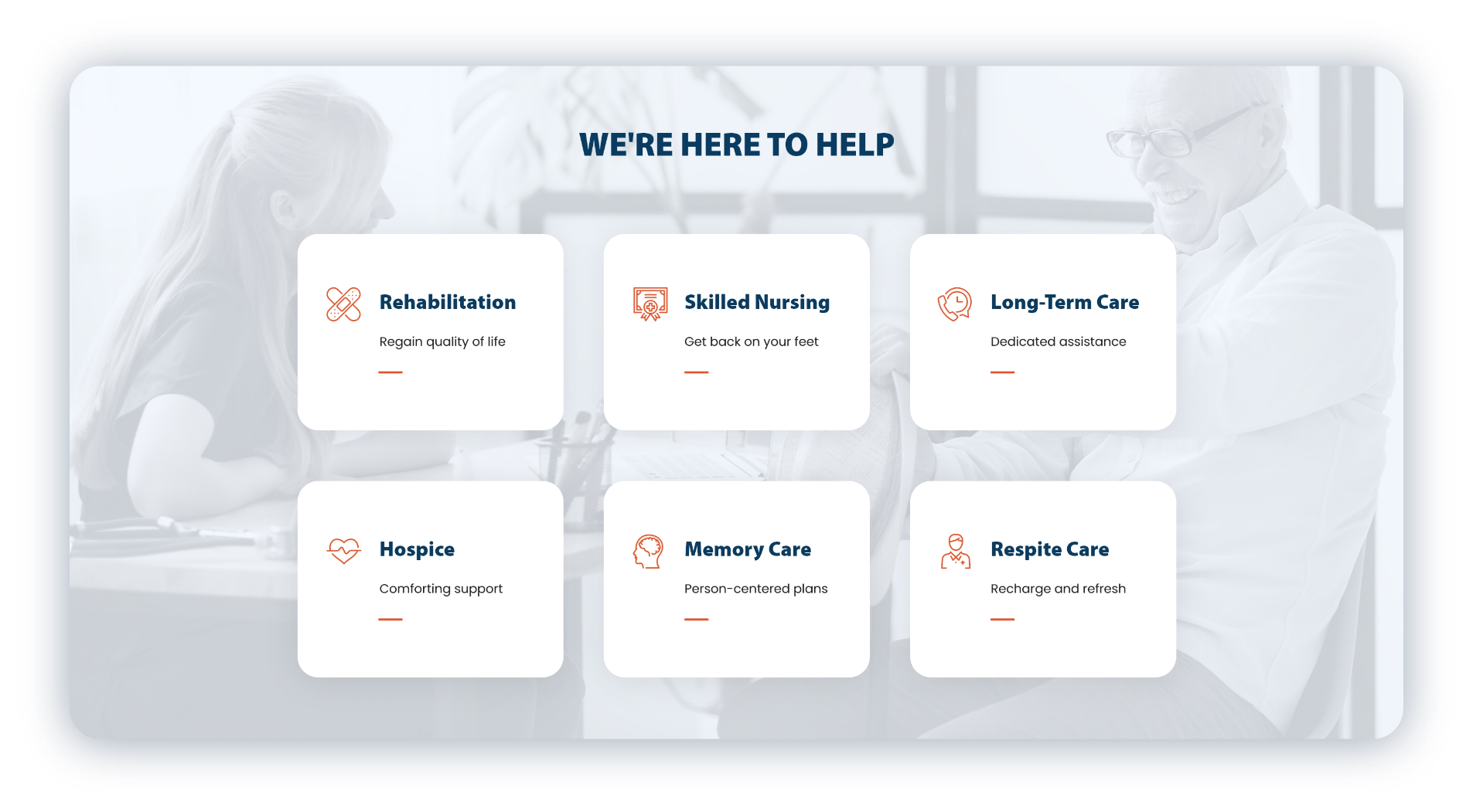
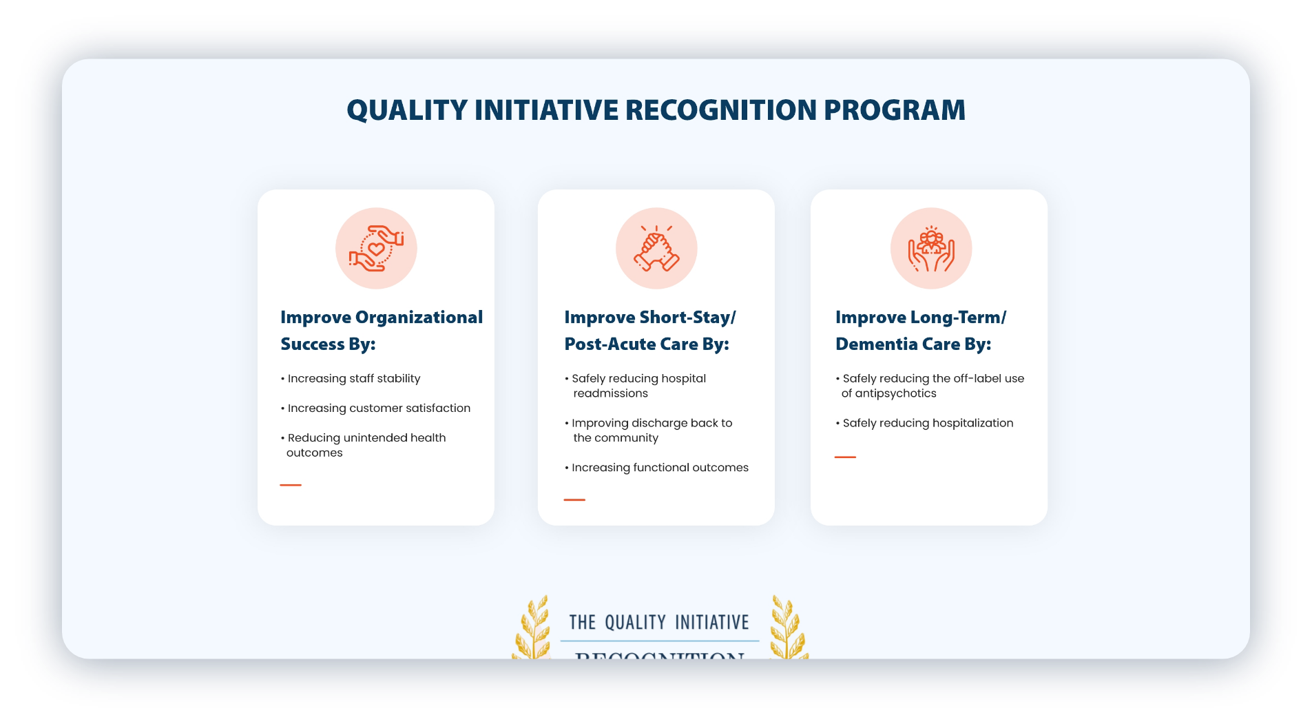
To address the challenges faced by Accura Healthcare, I undertook a comprehensive redesign of their website. I focused on modernizing the design and enhancing the user experience by improving the hierarchy and navigation structure. By reorganizing content and implementing clear call-to-actions, I ensured that users could easily find the information they needed. One key feature I introduced was a search and sort functionality, allowing users to quickly locate facilities based on their location, thus streamlining the process of finding nearby care options for seniors. These enhancements not only modernized the website’s look and feel but also provided users with more defined paths to navigate and engage with Accura Healthcare’s services.


