
LearningLink
UX / UI
Branding
Product Design
Prototype
Summary
Challenge
ActionSelling faced the challenge of modernizing their digital presence to better engage with their audience and elevate their brand image. The existing website, platform (LearningLink), and marketing materials lacked cohesion and failed to effectively showcase the company’s innovative training programs. Users struggled with navigation, and the overall user experience fell short of expectations. Additionally, the marketing materials lacked impact and failed to generate the desired leads. It was evident that a comprehensive overhaul was needed to address these issues and position ActionSelling as a leader in professional training programs.
Solution
To meet the challenge head-on, I embarked on a multifaceted solution aimed at transforming ActionSelling’s digital ecosystem. Beginning with the website, I redesigned the interface to prioritize intuitive navigation and impactful calls to action. Incorporating modern design elements such as cohesive icons and contemporary fonts, I crafted a visually appealing yet professional aesthetic that resonated with the target audience. Simultaneously, I revamped the training platform to enhance structure and user experience, incorporating dynamic features to foster engagement and skill development. Finally, I reimagined the marketing materials, leveraging persuasive messaging and captivating visuals to drive lead generation and reinforce brand identity. Through meticulous attention to detail and a user-centric approach, the comprehensive solution aimed to position ActionSelling as a premier provider of professional training programs while elevating their digital presence to new heights.


UX / UI
User Research
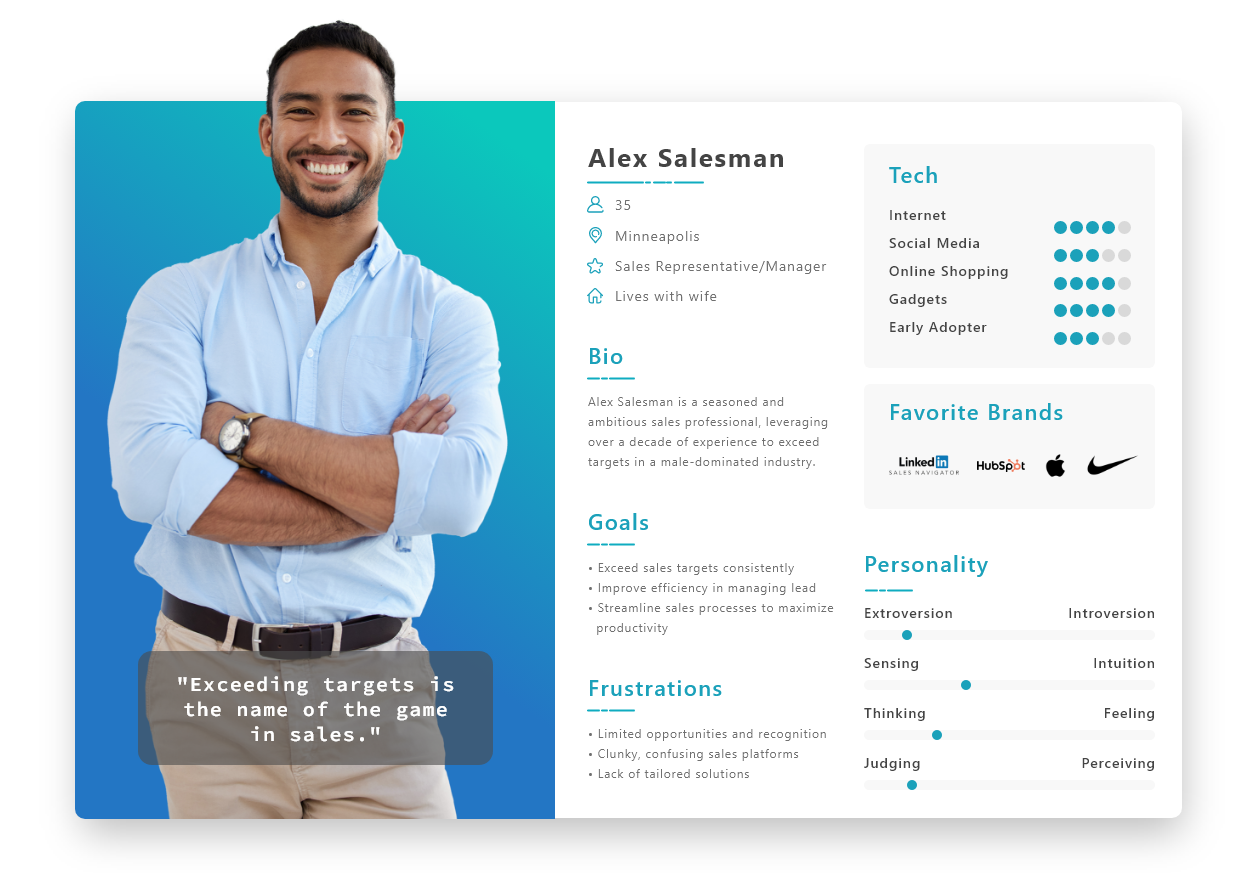
The product owner completed the user research and competitive analysis. In short, men dominate when it comes to sales teams – studies consistently show men make up about 71% of sales representatives and 74% of sales managers. Competitive solutions were clunky or confusing – so our platform needed to be modern and easy to use in order to compete in the sales performance marketplace.
Persona
Based on the findings of the user research and data, I created a persona to help inform my decisions as I started to design.
Branding
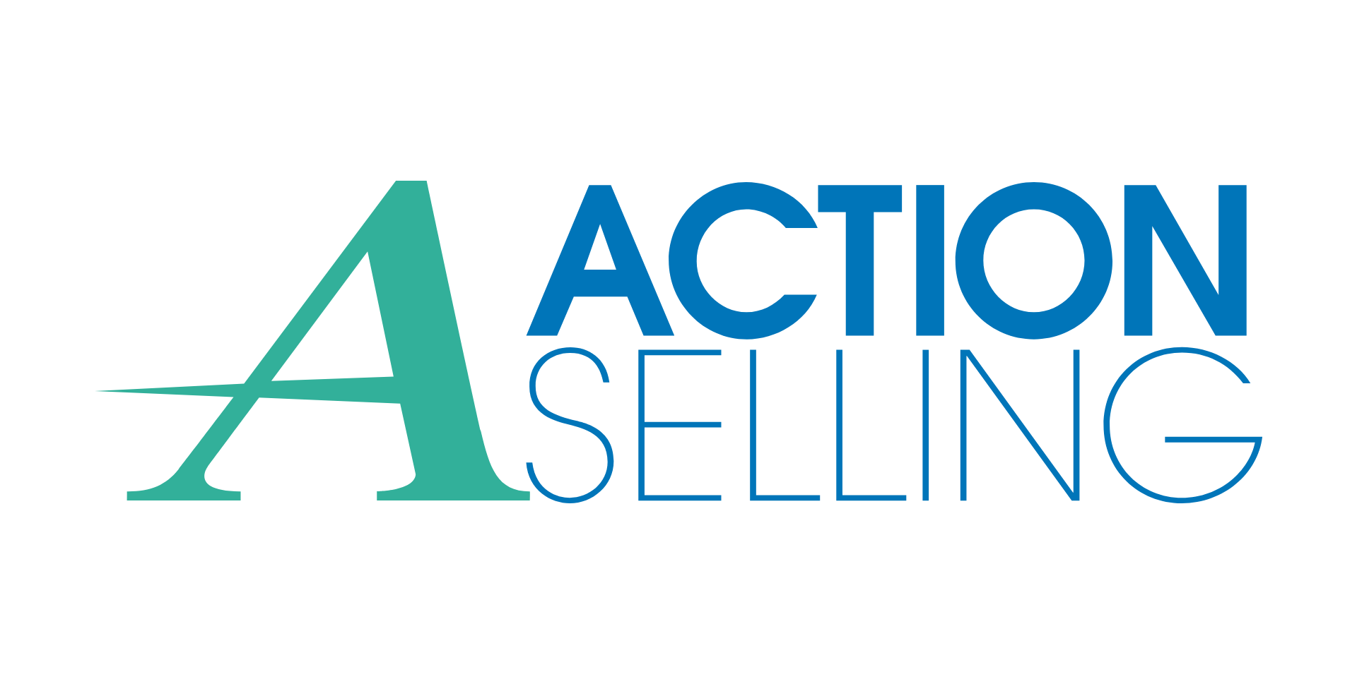
Logo
For the logo, I crafted a sleek and modern “A” as the focal point, with an elongated bar extending beyond the first leg and tapering to a point. This design choice symbolizes progress, innovation, and forward-thinking, aligning perfectly with our brand’s ethos. To infuse vibrancy and freshness, I incorporated teal green accents alongside a bold blue primary color, creating a visually striking yet cohesive logo.
Brand Identity / Design System
Color Palette: I curated a color palette featuring bold blue as the primary color, representing trust and reliability, while teal green accents add a touch of vibrancy and energy. Consistency in color usage across all branding materials ensures brand recognition and cohesion.
Typography: I selected a clean and modern sans-serif font for the brand name and accompanying text, reflecting professionalism and readability. This font choice reinforces our commitment to delivering high-quality training programs and services.
Visual Elements: Throughout the branding, I incorporated dynamic and cohesive visual elements, such as geometric shapes or lines inspired by the elongated bar in the logo. These elements enhance the overall aesthetic and reinforce our brand’s message of innovation and growth.
Imagery: I curated professional and impactful imagery that portrays success, teamwork, and achievement. By showcasing satisfied clients, productive sales teams, and dynamic workplace environments, we communicate our brand’s ability to transform businesses and drive success.
Brand Voice: I defined a brand voice that strikes a balance between professionalism and approachability, reflecting our commitment to empowering business teams. Consistency in tone across all communication channels ensures that our brand message resonates effectively with our target audience.
