
JourneyMapper
UX / UI
Branding
Mobile App Design
Prototype
Summary
Challenge
My primary challenge for JourneyMapper was to simplify the complex process of trip planning while maintaining functionality. This involved designing a user-friendly interface, integrating modern design elements, and ensuring accurate technical implementation to address the diverse needs of travelers effectively.
Solution
I tackled these challenges through a user-centric design approach, streamlining the user interface with intuitive features like drag-and-drop itinerary planning and real-time route updates. Modern design elements, including a vibrant color scheme and sleek typography, were incorporated to enhance the user experience.


UX / UI
User Research
Research revealed that the majority of vacation planning, about 75%, is done by women. Millennials, aged between 23 and 38, emerge as the most frequent travelers, enjoying an average of 35 vacation days per year. In 2019, baby boomers notably spent over $6,600 on their holiday endeavors. Additionally, a significant proportion of millennials, approximately one-third, are willing to allocate $5,000 or more annually toward their travel pursuits.
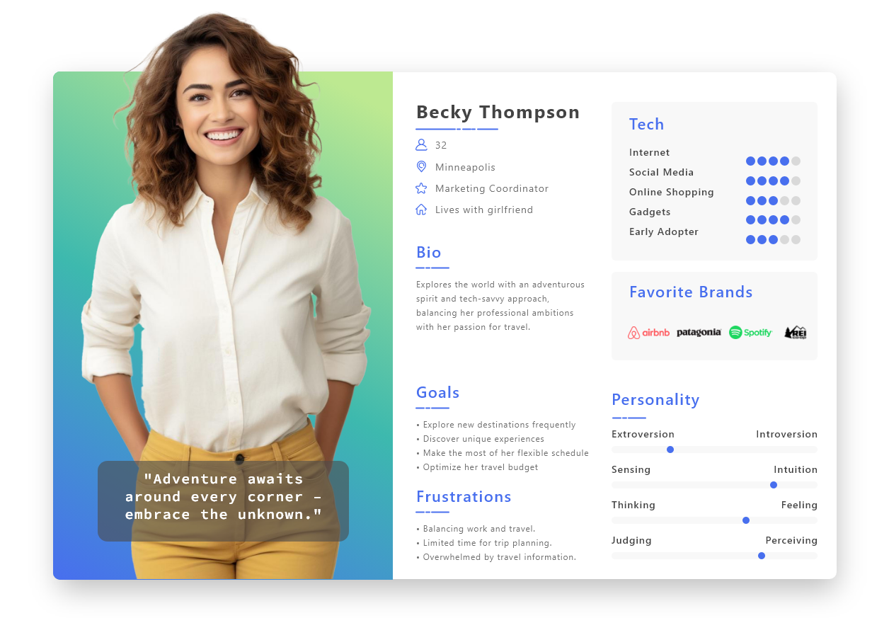
Persona
Based on the findings of the user research and data, I created a persona to help inform my decisions as I started to design.
User Interface
I designed the app’s user interface to be intuitive and user-friendly, with clear navigation and intuitive features that guide users through the trip planning process. This included implementing features such as drag-and-drop itinerary planning, real-time route updates, and personalized recommendations based on user preferences.
Branding
Logo
The logo features a stylized hot air balloon in a vibrant green color against a white background. The hot air balloon symbolizes adventure, exploration, and travel, while the color scheme conveys modernity and vibrancy.
Design System
Color Palette: I’ve chosen vibrant blue to represent trust, reliability, and professionalism, while vibrant green symbolizes growth, harmony, and nature. To enhance the vibrancy of these colors and give our design a modern and fresh look, I’ve opted for white as the backdrop. This clean and minimalist choice not only complements the vibrancy of the blue and green but also adds a sense of openness and simplicity to the brand identity.
Visual Design I carefully crafted the app’s visual design to appeal to modern users, with a vibrant color scheme, sleek typography, and minimalist graphics that enhance the user experience. This helped create a visually engaging interface that encourages users to explore and plan their trips with ease.


