BuySellTrade
Summary
Challenge
My client used multiple platforms to buy, sell, and trade collectibles like Funko Pops, trading cards, etc. He wanted to simplify this process and provide an easier, better experience for other collectors like himself.
Solution
I designed a marketplace that allowed dedicated fanbase to easily buy, sell, and trade their collectibles. It also provided a sense of community – allowing them to geek out and appreciate each other’s collections.
UX / UI
User Research
Collectibles resonate with a broad audience, but the average age of a customer buying a Funko Pop is 36 years old and lean slightly more towards women than men. People collect Funko Pops for various reasons including unique designs, the nostalgia they invoke, the challenge of collecting, their affordability and ease of display, fandom, potential investment value, and enjoyment of the collecting process.
Persona
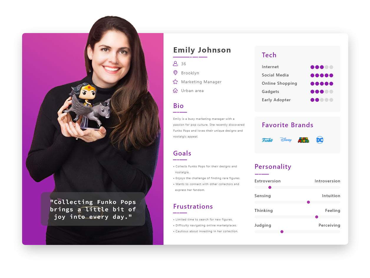
Based on the findings of the user research and data, I created a persona to help inform my decisions as I started to design.
User Flow
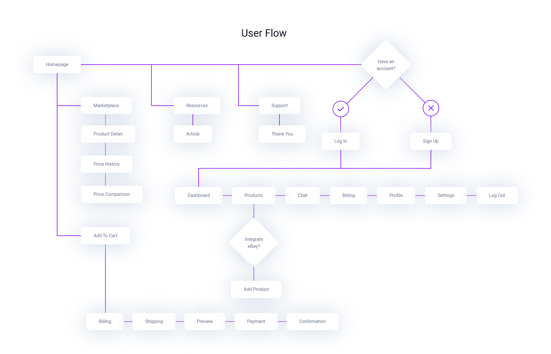
I created a user flow chart to help diagram the most common paths the user would take within the application to complete their tasks. This helped the product team when it came time to building an appropriate user experience and presenting the correct information to users at the right time. It also allowed users to complete their desired tasks in as few steps as possible.
Branding
Logo
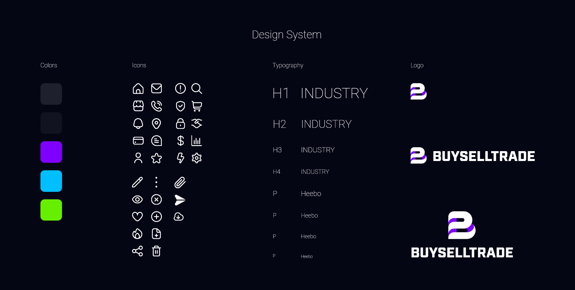
The logo for BuySellTrade features a clean and modern design. The integrated B represents the dynamic and fluid nature of the platform. Just as the B seamlessly merges with itself, the community seamlessly connects with one another, forming a vibrant network of enthusiasts who share a passion for Funko Pop culture.
Design System
Color Palette: Purple, with its bold and vibrant hue, symbolizes creativity, imagination, and individuality—values that are central to the Funko Pop collecting experience. It reflects the diverse array of characters and themes celebrated within our community and serves as a beacon for collectors seeking unique and exciting additions to their collections.
The white accentuates the sleek and modern aesthetic of our brand, signifying transparency, trust, and accessibility. It represents our commitment to providing a user-friendly platform where collectors can easily navigate listings, connect with sellers, and engage in seamless transactions.
Typography: The brand uses a combination of clean, sans-serif fonts for a contemporary look. The primary font is Industry for headings and titles,
Visual Elements: Apart from the logo, visual elements such as dynamic icons have been incorporated to add visual interest and reinforce the brand’s identity.
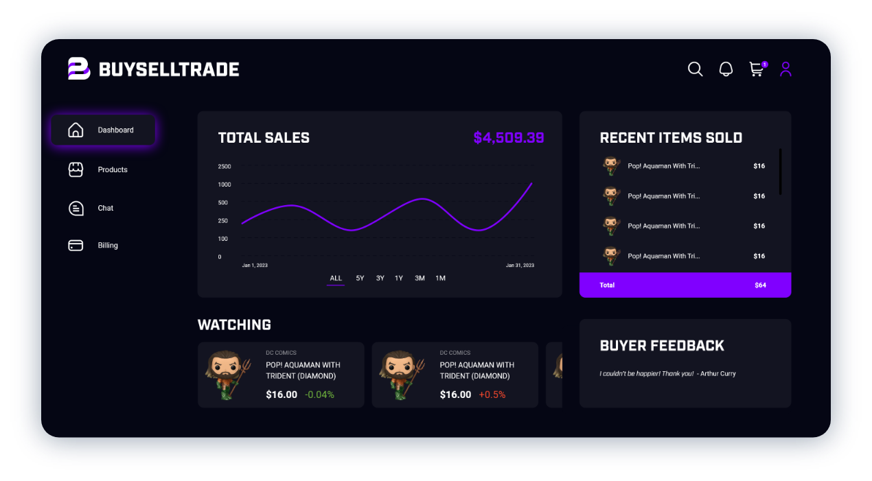
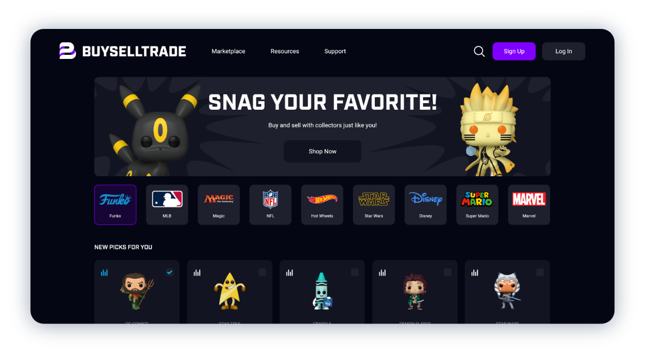
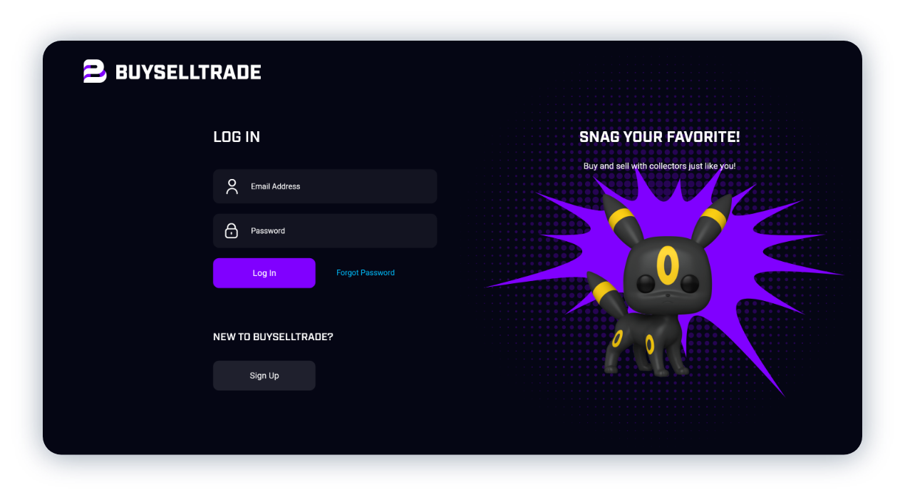
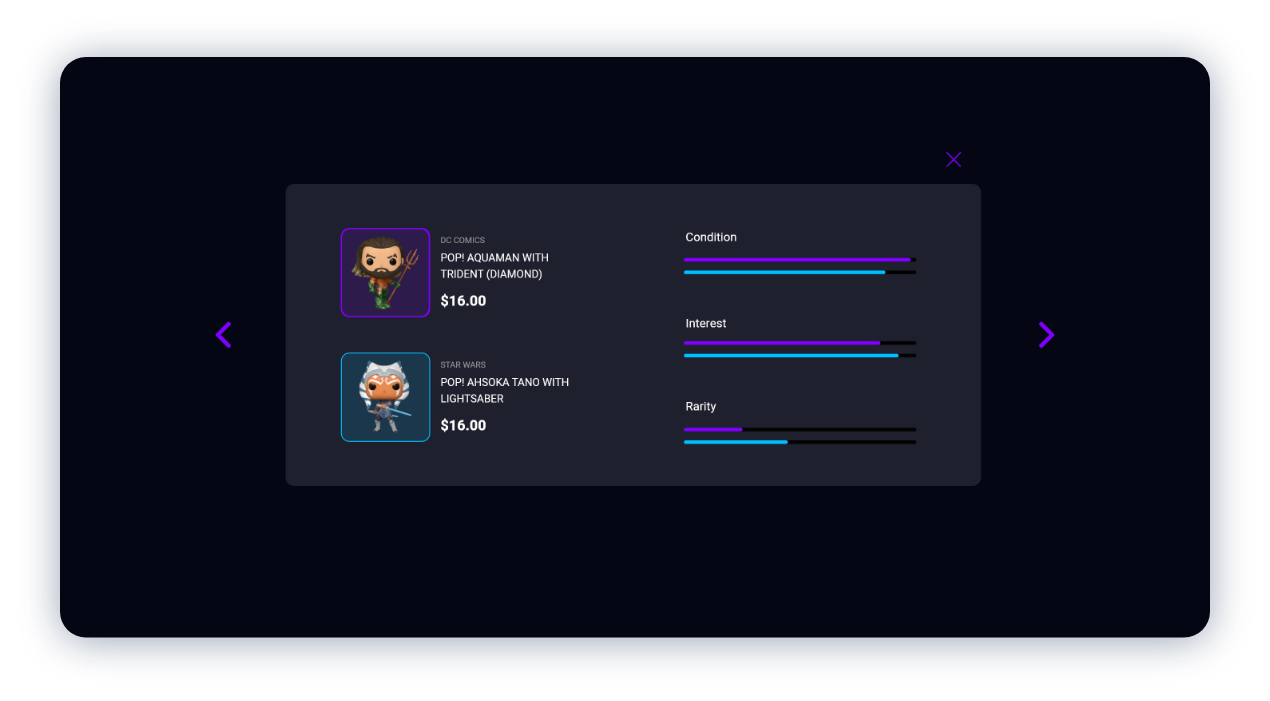
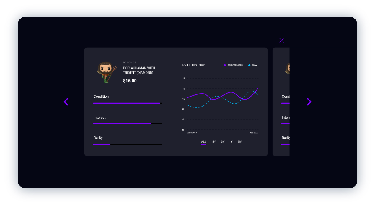
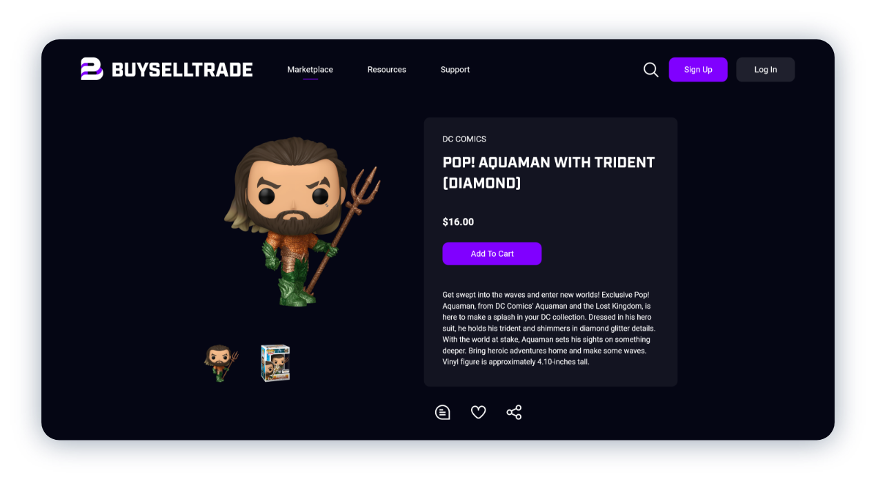
Website Design: I chose a dark interface with bright purple accents for the website design to provide a visually striking and cohesive user experience. I ensured that the website was user-friendly and intuitive, with clear navigation and easy access to search and browse Funko Pop listings.
By incorporating these elements into my logo and brand identity, I created a cohesive and visually appealing identity for “Buy Sell Trade” that resonates with Funko Pop collectors and communicates the fun and vibrant nature of the marketplace.
