
Nuraflo
Product Design
Branding
UX / UI
AI Experience
Overview
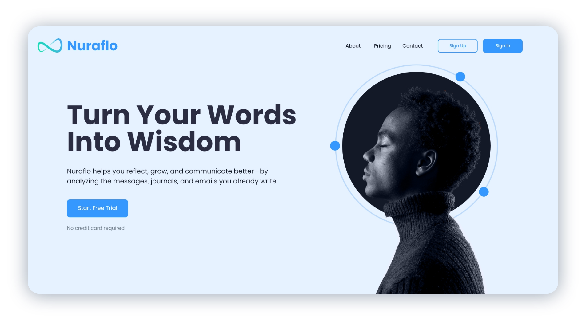
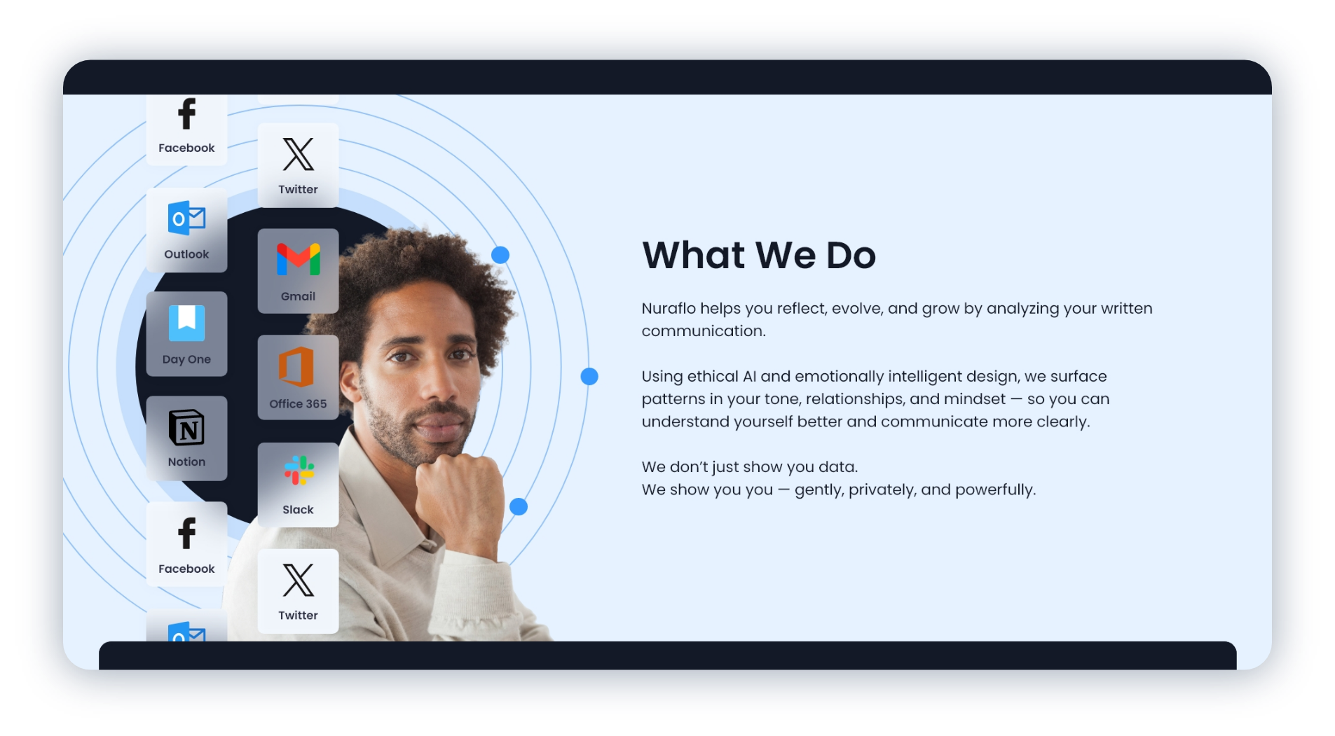
Nuraflo is a conceptual AI platform designed to help people better understand themselves through the words they already write. From branding and UX strategy to product design and AI-powered insights, the project explored how thoughtful design can transform everyday communication into meaningful personal growth.
Challenge
Most AI tools focus on helping people create more. Nuraflo explored how AI could instead help people better understand themselves while balancing privacy, transparency, and emotional trust.
Solution
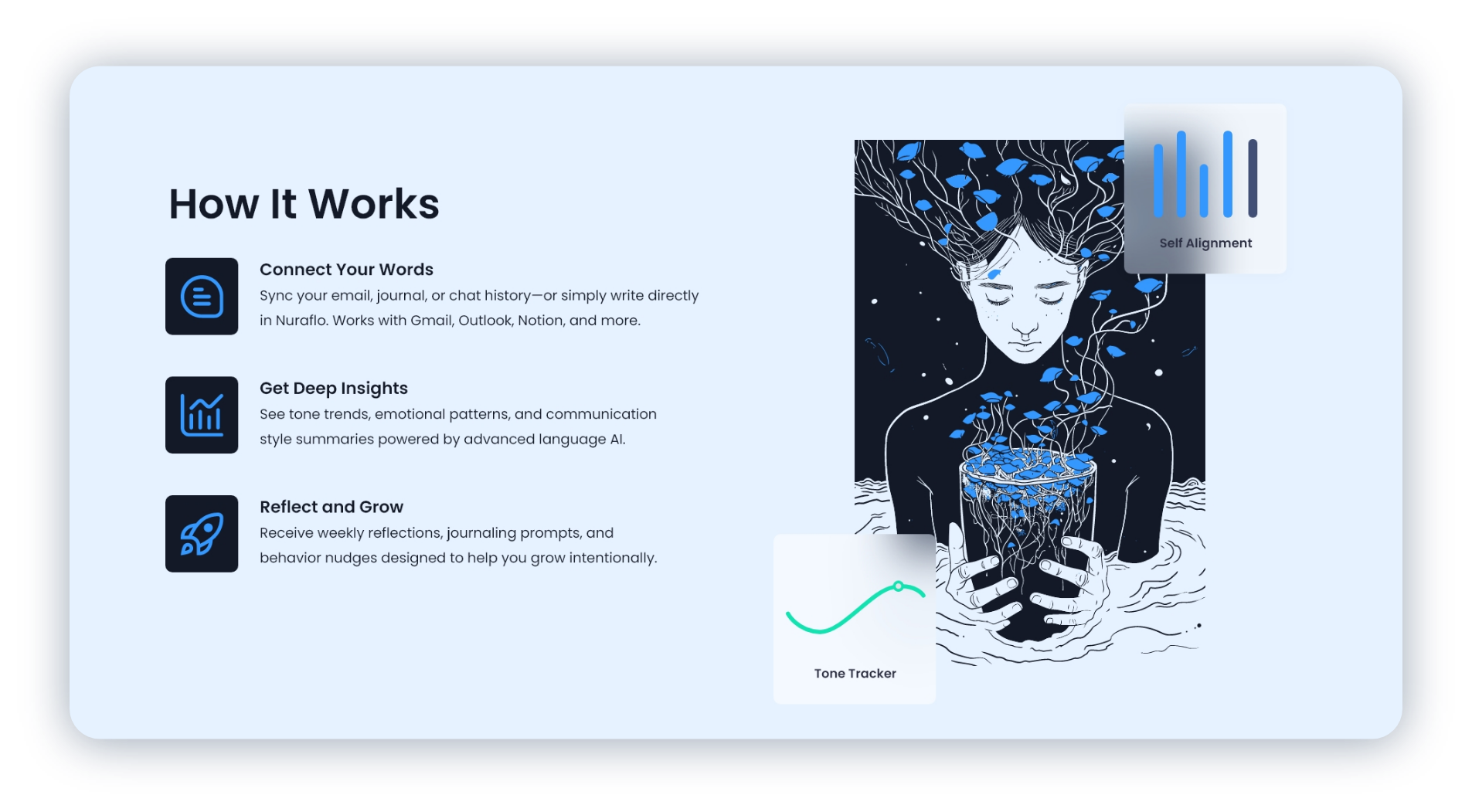
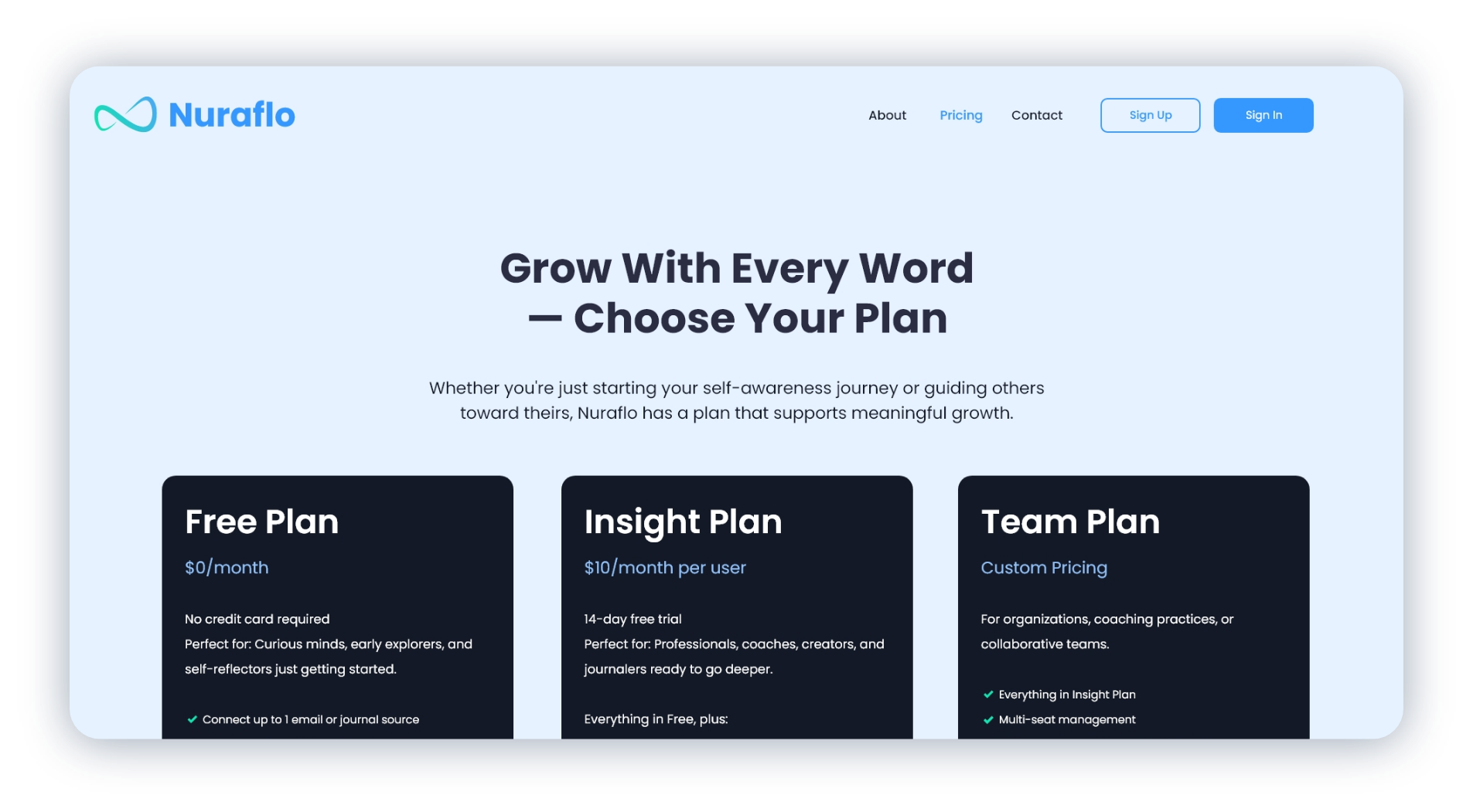
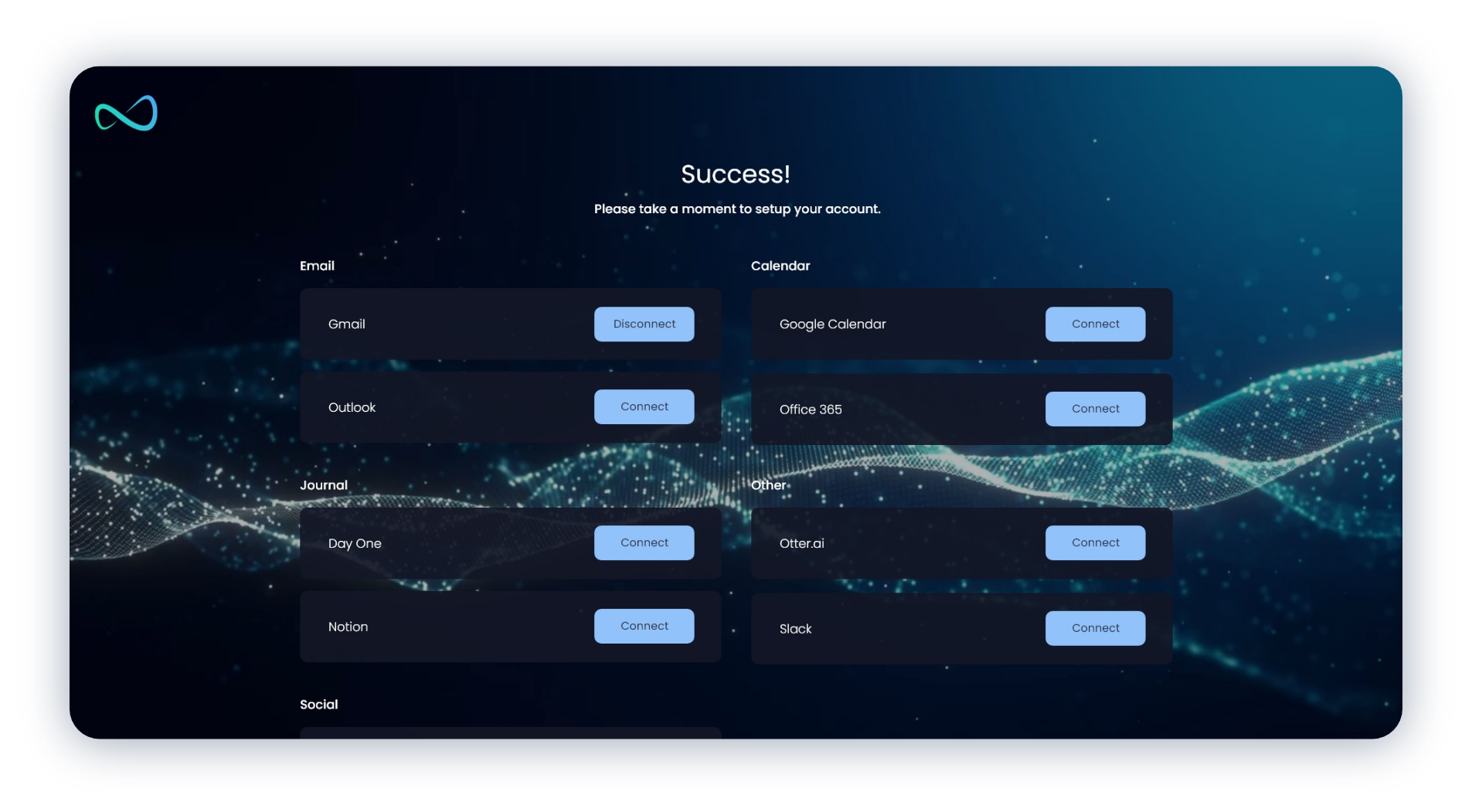
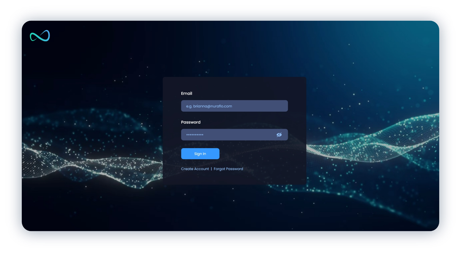
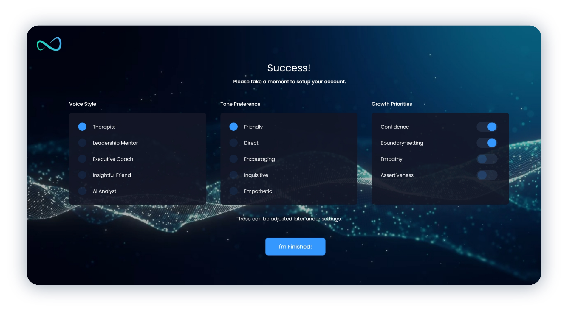
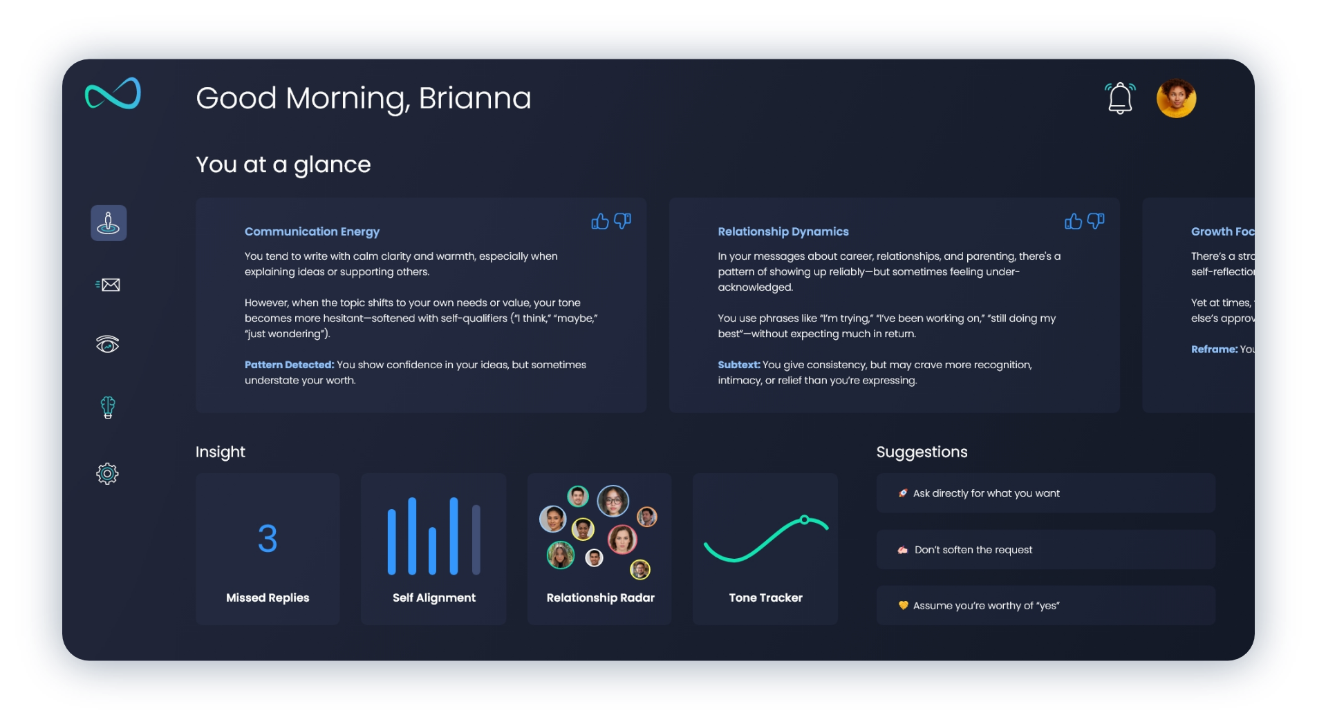
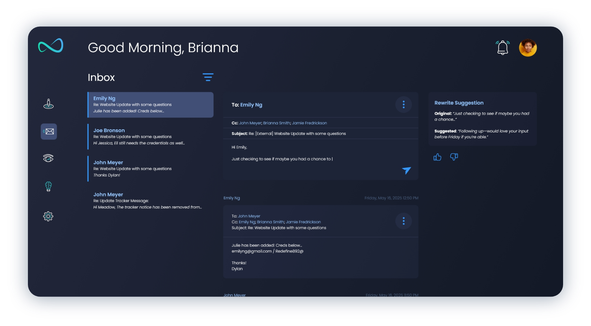
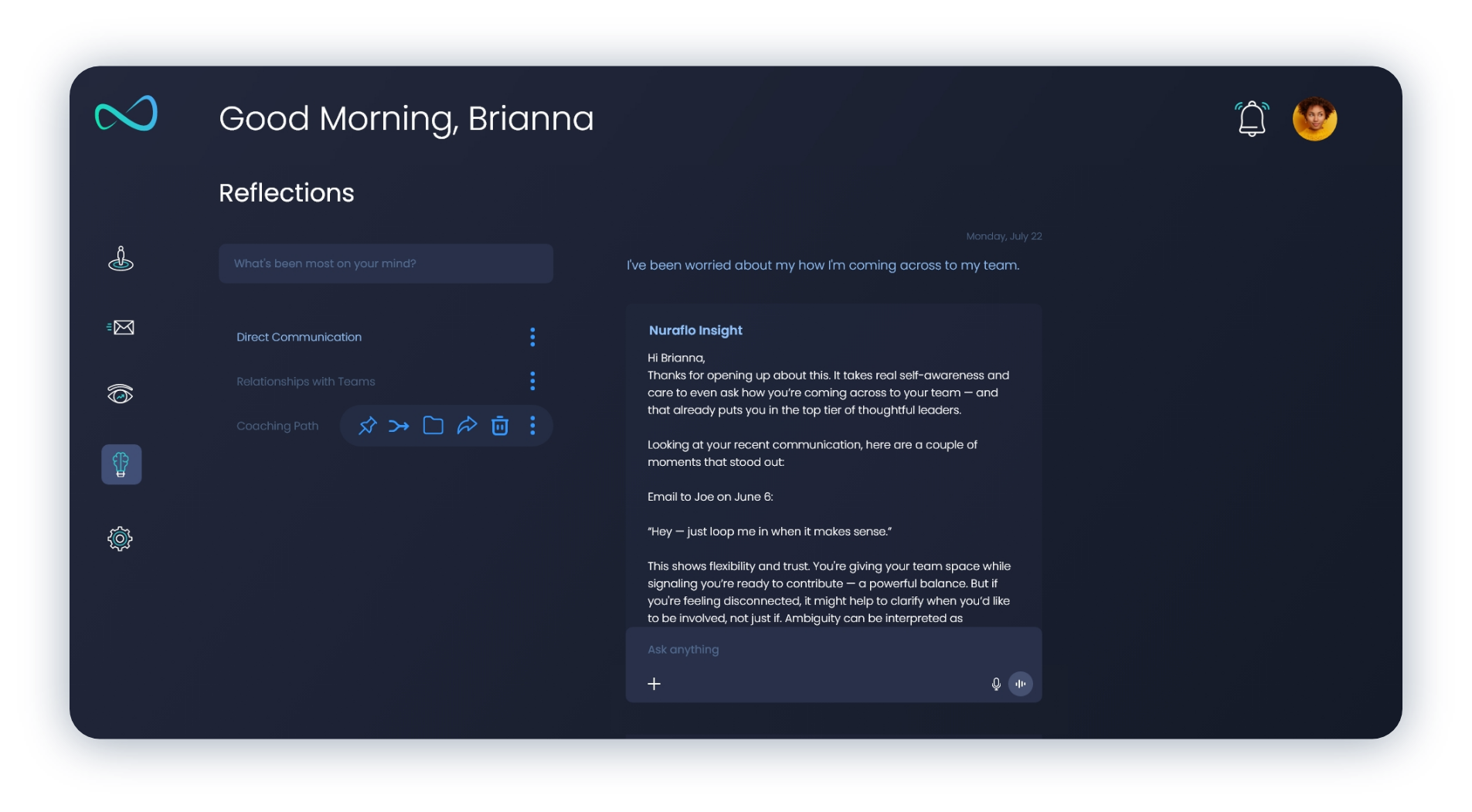
Designed the Nuraflo brand identity and an end-to-end AI product experience including onboarding, dashboards, behavioral insights, personalization, and AI-powered reflection tools. Every interaction was designed to make complex behavioral analysis approachable and actionable.
My Role
- Product Strategy
- UX/UI Design
- Brand Identity
- Design System
- Information Architecture
- Interactive Prototyping
- AI Experience Design
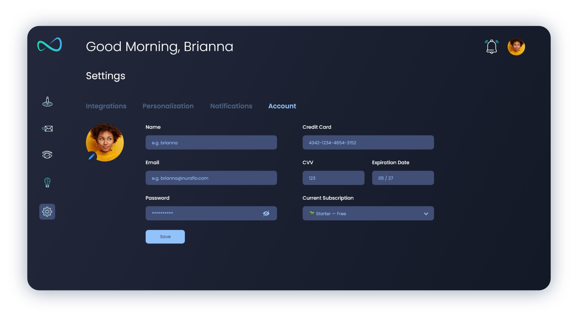
UX / UI
Discovery
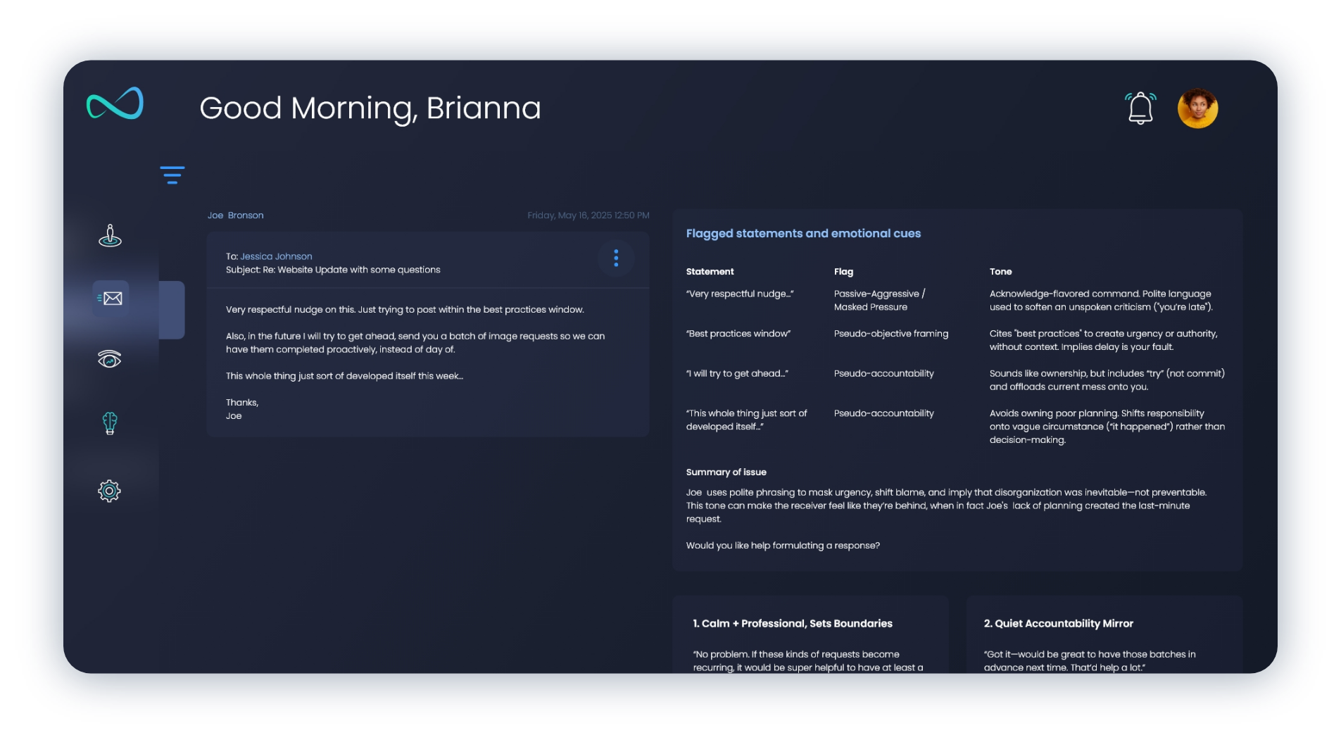
The discovery phase focused on understanding why people struggle to recognize their own communication patterns. While AI tools increasingly help users write faster, few encourage reflection on how they communicate or what recurring behaviors may be influencing their relationships.
Research centered on balancing meaningful behavioral insights with simplicity, privacy, and emotional trust—creating an experience that feels supportive rather than analytical.
Persona
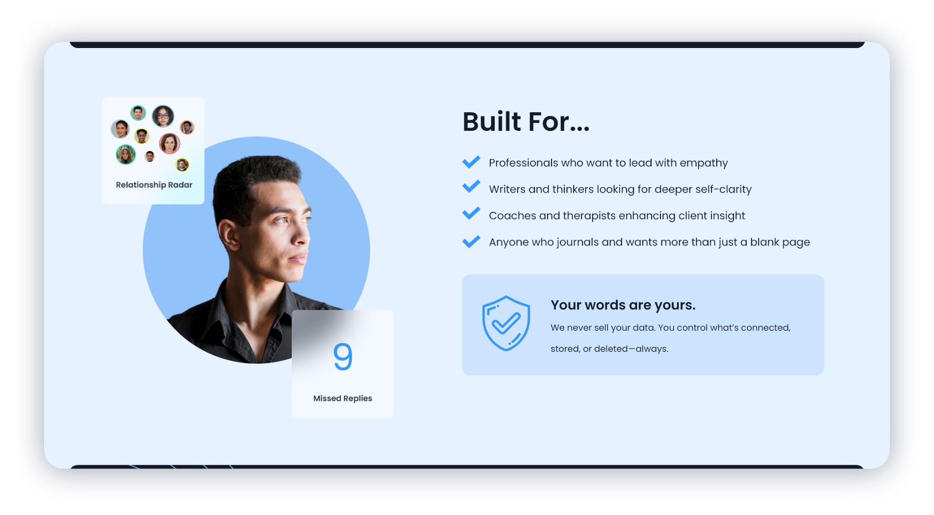
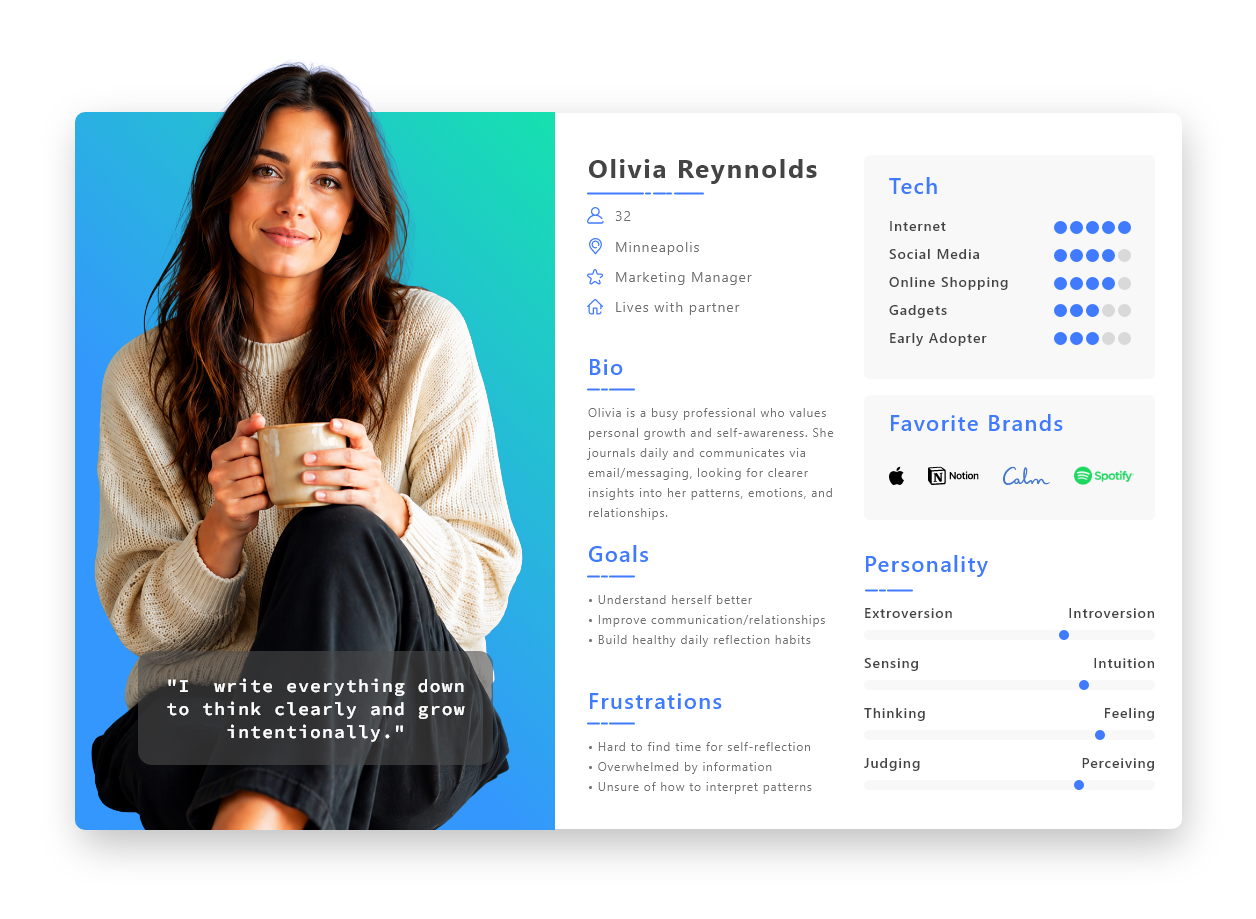
Nuraflo was designed for thoughtful professionals who communicate constantly through emails, messages, and journals but rarely have time to reflect on what those conversations reveal about themselves.
The primary user values personal growth, emotional intelligence, and authentic relationships. Rather than generating more content, they want AI to surface meaningful patterns, improve self-awareness, and encourage intentional communication.
Branding
Brand Vision
Nuraflo was envisioned as a thoughtful companion for personal growth rather than another productivity tool. Every design decision reinforced clarity, reflection, and emotional trust.
Design System
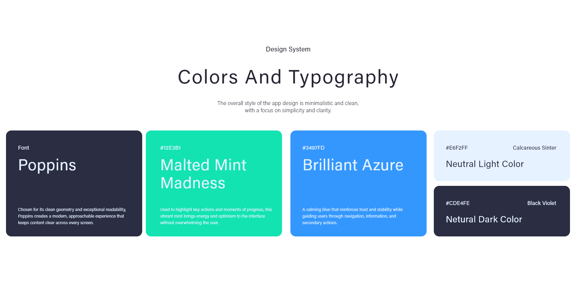
Color Palette: The visual system was designed to feel calm, intelligent, and trustworthy rather than overly technical. Soft blues establish clarity and confidence while teal accents communicate growth, reflection, and positive behavioral change.
Dark interfaces were intentionally used throughout the dashboard to reduce visual fatigue during extended reading sessions, allowing highlighted insights and conversational data to remain the primary focus.
Typography: Nuraflo pairs a modern geometric sans-serif with generous spacing and clear hierarchy to make complex behavioral insights feel approachable and easy to digest.
Large headings establish confidence while restrained body typography keeps lengthy AI explanations, email analysis, and reflection prompts highly readable across desktop and mobile experiences.
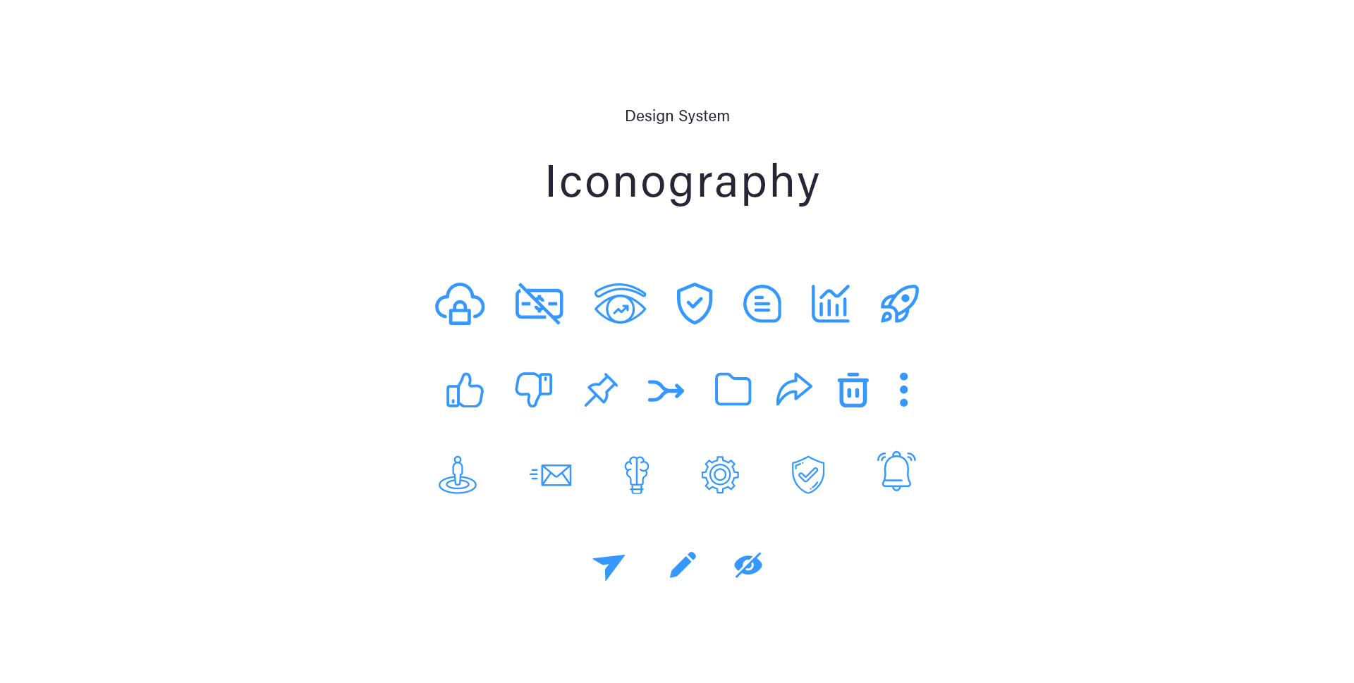
Visual Elements: Every interface element was designed to reinforce the feeling of reflection rather than productivity.
Recurring circular motifs represent continuous personal growth and evolving relationships, while clean cards, subtle gradients, and generous whitespace reduce cognitive load across dashboards containing dense behavioral insights.
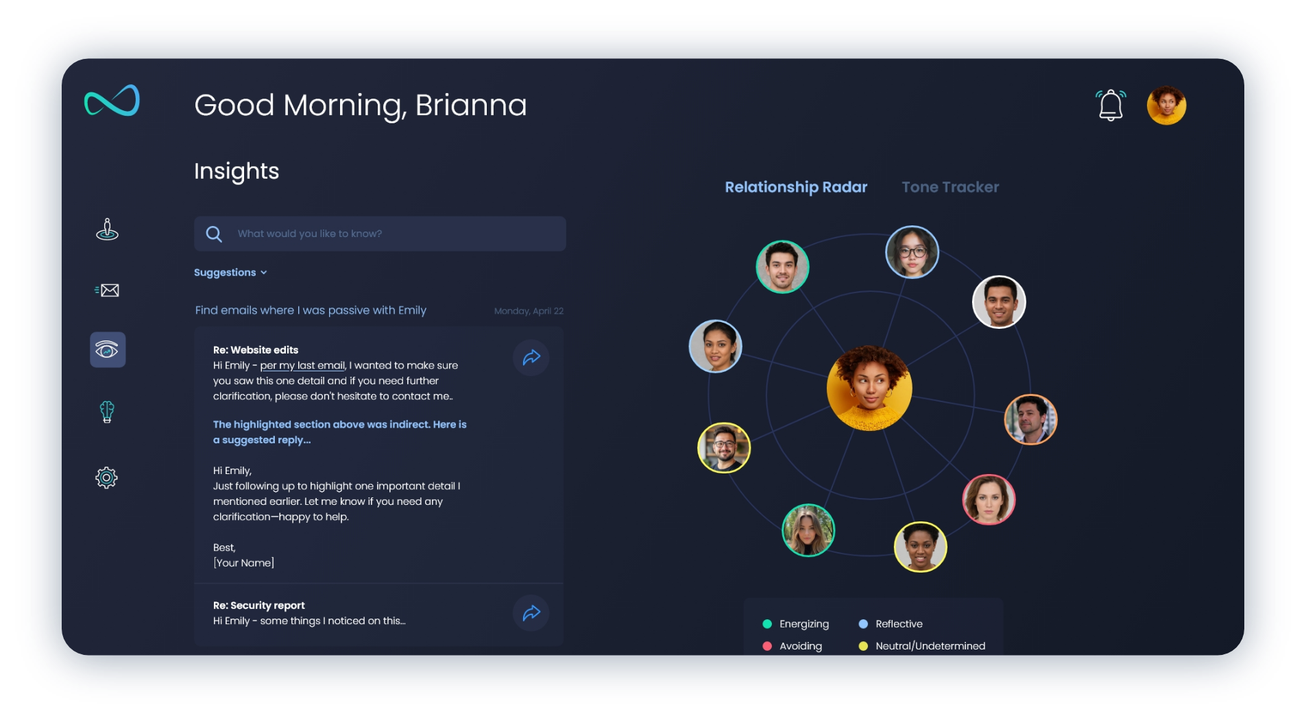
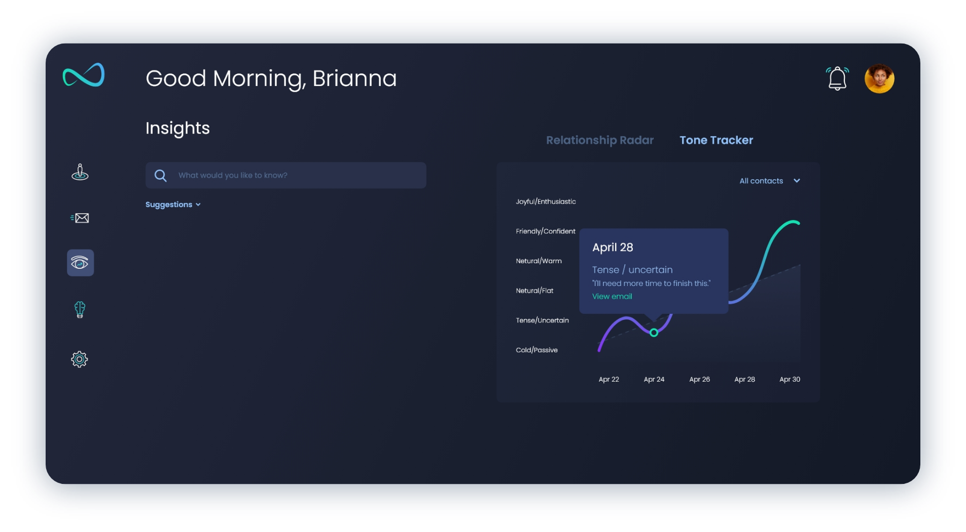
Illustrations and visualizations transform abstract emotional concepts into approachable experiences—from the Relationship Radar and Tone Tracker to conversational analytics and growth recommendations. Together these components create an interface that feels less like software and more like a thoughtful personal companion.
Logo: The Nuraflo identity was designed around the idea of continuous growth through reflection. At its core, the mark forms an abstract “N” while simultaneously creating a fluid, continuous shape that represents the flow of communication, insight, and personal transformation. Rather than leaning into traditional AI symbolism, the logo embraces simplicity and movement to create an identity that feels approachable, human, and timeless. Combined with a modern blue-to-teal palette and clean typography, the mark establishes a recognizable foundation for the entire brand.