
WOMS
UX / UI
Branding
Mobile App Design
Prototype
Summary
Challenge
As a designer tasked with developing an app for WOMS, my challenge lay in creating a platform that catered to the needs of homeowners, WOMS’s targeted demographic. These homeowners often struggled to keep track of vital house-related documents, notes, images, and project details, leading to disorganization and inconvenience. Moreover, the absence of a centralized solution hampered their ability to efficiently share this information with potential buyers when selling their homes. Hence, my aim was to design an app that addressed these pain points by providing a seamless and user-friendly way for homeowners to store, organize, and share all relevant house-related information.
Solution
To meet the needs of WOMS’s targeted demographic, I proposed the development of a comprehensive mobile application tailored specifically for homeowners. This app would serve as a centralized platform where users could effortlessly store and manage documents, notes, images, project ideas, appliance information, receipts, and a calendar/timeline of house-related activities. By incorporating features such as easy organization, quick access to specific details like paint colors and contractor contacts, and seamless sharing capabilities, my solution empowered homeowners to efficiently manage their house-related information. Through this app, WOMS could provide its users with enhanced organization, accessibility, and efficiency, ultimately delivering a valuable tool that enriched the homeowner experience.


UX / UI
User Research
I worked with another agency (i.e. Orman Guidance) who’s main focus was user research. They completed a competitive analysis, usability study, and a brainstorming session to help flush out what the stakeholders envisioned when they thought about the brand and the app.
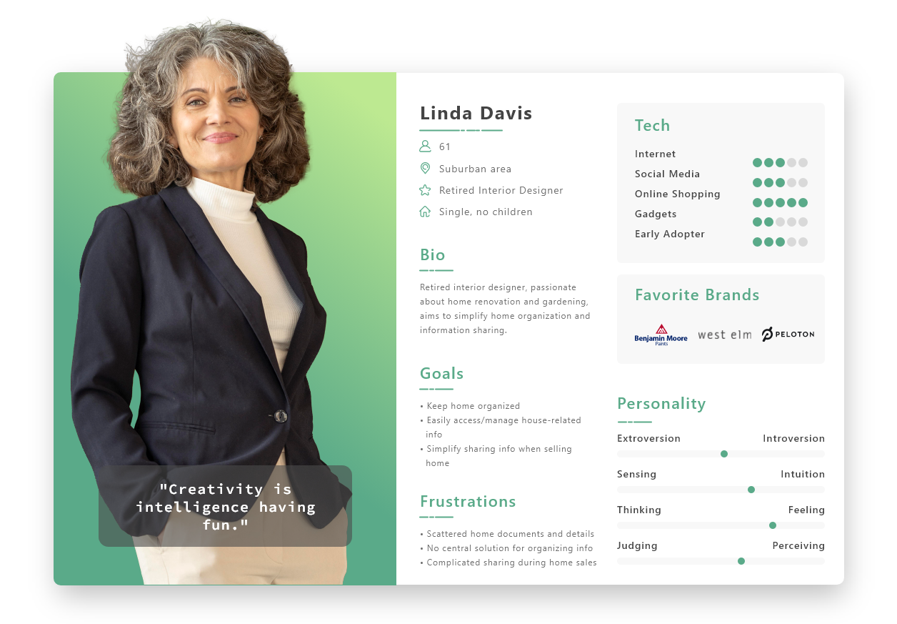
Research also showed that single women own approximately 12.9% of owner-occupied homes in the 50 states, while single men own around 10.06%. In 2022, baby boomers, aged 58-76, surpassed millennials as the largest share of homebuyers, comprising 39% compared to millennials’ 28%. Additionally, boomers’ share of home sales increased from 42% in 2021 to 52% in 2022.
Armed with these details, I had enough to start working on mockups and branding.
Persona
Based on the findings of the user research and data, I created a persona to help inform my decisions as I started to design.
Branding
Logo
For the logo design of WOMS, I crafted a distinctive symbol featuring a sideways “W” that cleverly abstracted both a roof and an arrow, reflecting the idea of encompassing everything under one roof.
Brand Identity / Design System
Color Palette: To evoke a sense of growth and energy, I opted for shades of green in the color scheme.
Typography: For the typography, I selected Roboto for the header to lend a modern touch and Poppins for the body text, ensuring easy readability while maintaining a contemporary feel.
By combining these elements, I aimed to create a visually striking and cohesive brand identity for WOMS.
